Client: CreativeMMS
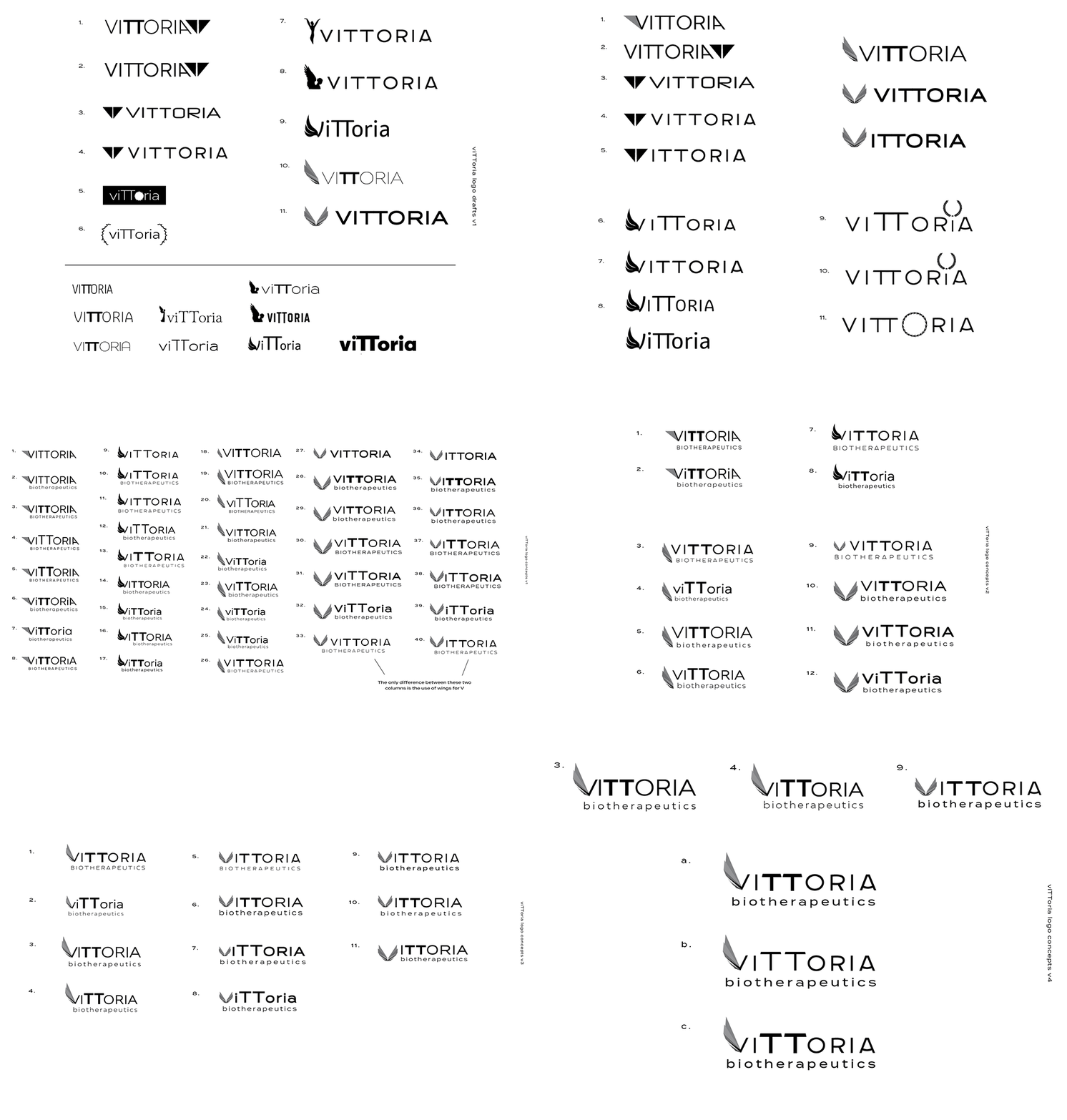
[2021] I was contacted by the team at Creative MMS to create a new logo for their pharmaceutical company, who was working on a new cancer treatment therapy. The main components the client wanted to see were the symbolism of Victoria, the Roman goddess of victory. Another goal was to highlight the double ‘t’ in the name because their new treatment worked with the patient’s T-cells. They also wanted something that would stand out from traditional pharmaceutical logo designs.
Working with CreativeMMS’ lead designer, I created many iterations to propose to the client. I wanted to make sure we were able to incorporate the client’s needs, while also making sure they would receive a logo that was professional and modern. Looking through hundreds of typefaces, I found one that I rallied for: the curve of the crossbar in the ‘A’ looked like a little grin, which helps portray positivity in the cancer treatment process. The wing helps bring Victoria goddess energy to the logo, and we kept the entire font in small caps except for the TT to highlight and create a connection to the T-cell therapy they provide. The client ultimately chose the version with the abstracted wing and smiling typeface, which definitely put a smile on all of our faces!
Final Logo + Variations


