Client: Public Art University of Houston System
[2022] Working with the Public Art department at the University of Houston (PAUHS) was a dream! We collaborated on many exciting projects, including the brand identity for the Warhol Exhibition, the visual identity for the Art on Screen annual film festival, and recreating the public art campus maps for cohesion across all five campuses.
I was also the web content manager for the PAUHS WordPress website. My first project was to audit their entire website and make the necessary edits to make sure there is cohesion throughout the site. I created a hierarchical set of typography rules for all titles and body text, ensured all links were hot and cohesive across the board, and created and/or updated graphics and images for consistent use across the site. Once the audit was complete, I continued with content updates and page builds as needed.
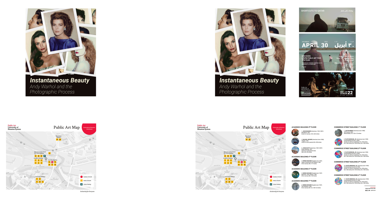
Instantaneous Beauty: Andy Warhol and the Photographic Process Brand Identity
Developed and implemented the brand identity for Instantaneous Beauty: Andy Warhol and the Photographic Process, the exhibition of Andy Warhol’s Polaroid images across two University of Houston campuses. Taking a Polaroid is a quick action, usually tossed on a table to continue developing, I wanted to recreate this feeling in the visual identity by using gifs and recreating piles of photos wherever I was able. This was a huge project for Public Art – we created graphics for online advertisements, social media, newspapers, and for the PAUHS website. I also created a custom landing page for the exhibitions.
Art on Screen Visual Identity
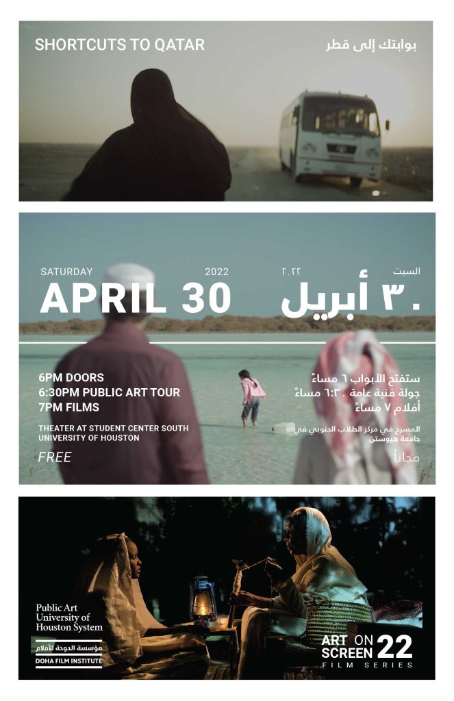
The Art on Screen Film Series is an annual themed event put on by PAUHS. 2022’s theme was titled Shortcuts to Qatar, featuring short films by filmmakers in Qatar. I chose to use film stills from three of the films, picked specifically because the faces are either somewhat obstructed or completely hidden–hoping to convey a feeling of intrigue to the viewer. I was lucky to be sharing studio space with a graphic designer from Qatar, who kindly provided the Arabic translation and helped me learn about Arabic language conventions and how it is displayed alongside English.
A poster, yard signs, social media assets, and digital signage graphics were created for the event.
Public Art Campus Maps Redesign
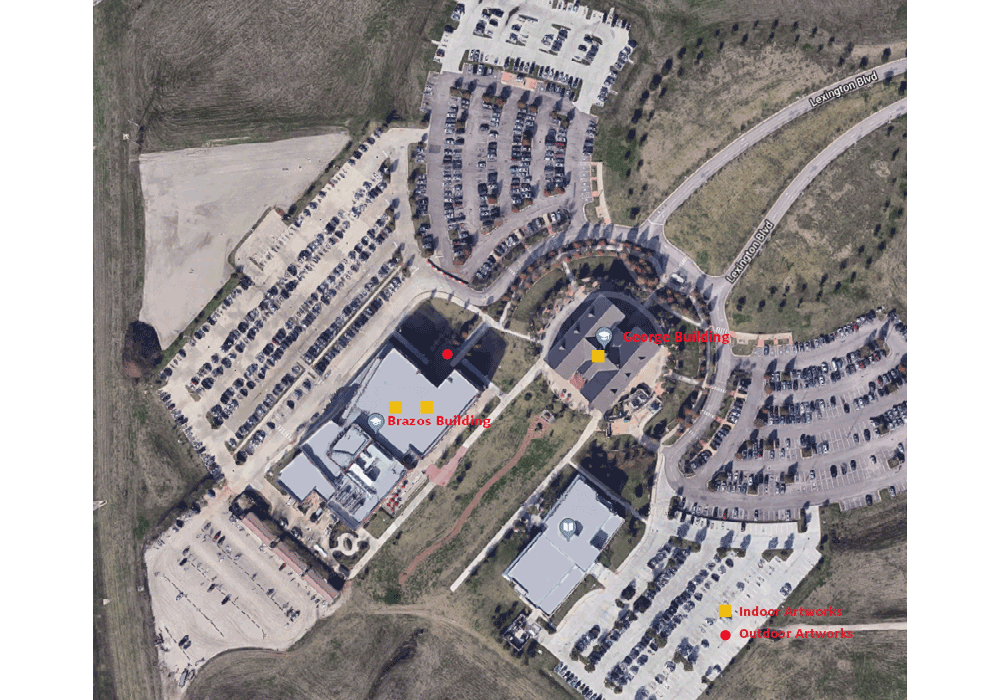
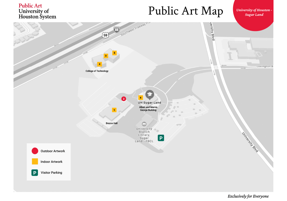
I know, campus maps might not be the most exciting designed object to show, but I love a good design problem and this was a fun one to tackle. The UH main campus already had a great campus map designed for all of their public art, but the other four campus maps lacked consistency and hierarchy. In addition, the public art office did not have access to the maps, which was a pain point for them when they needed to add new artwork or edit a piece when it goes to conservation.
Using the main campus map for consistency, I created new map templates for all four campuses from scratch, ensuring they all used the same design system so viewers knew that all campus artworks were, in theory, a unit, even though they are spread out over Southeast Texas. We added the PAUSH tagline “Exclusively for Everyone” to each map to further the messaging of their brand. Most importantly, I created the maps in Photoshop so they, or another designer, would be able to edit the maps in the future. Full maps (with interiors!) can be viewed here.
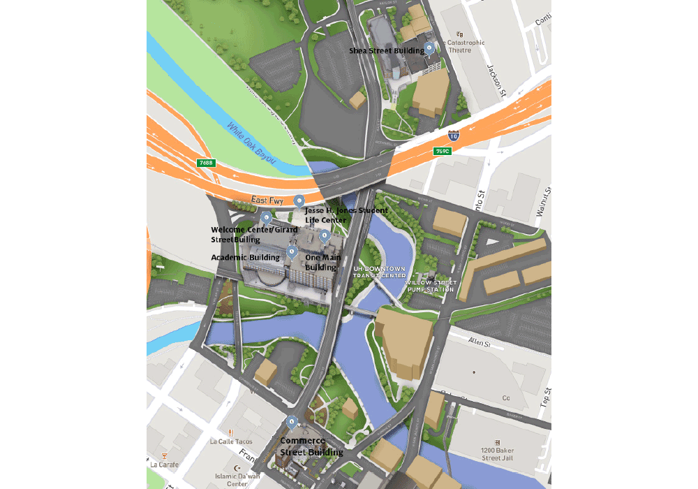
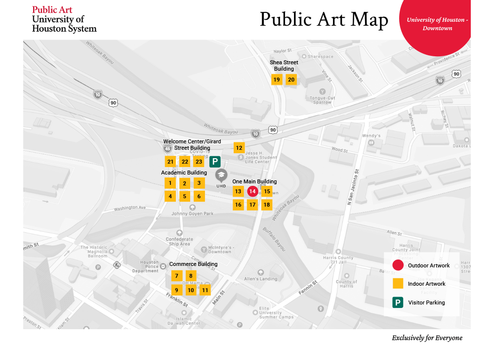
UHD map before + after
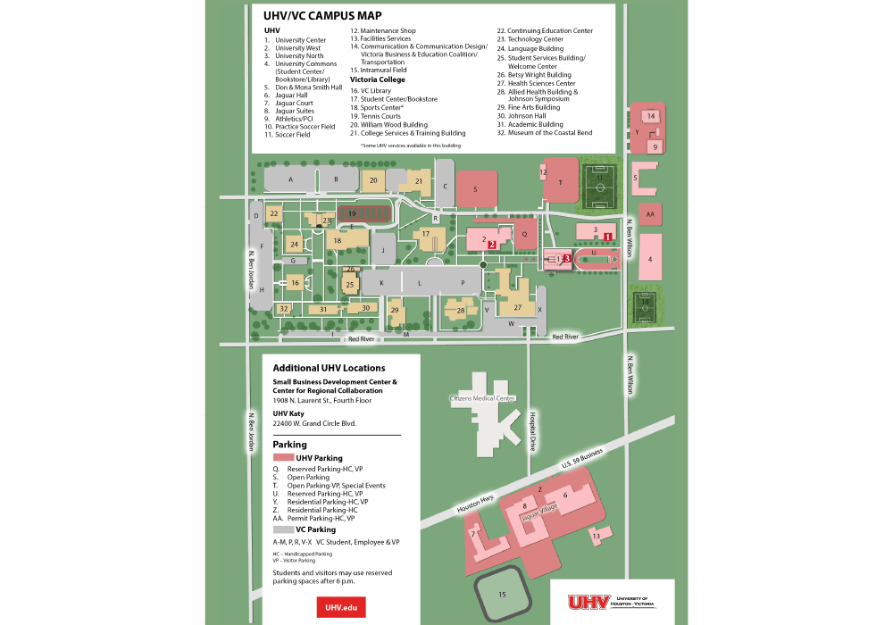
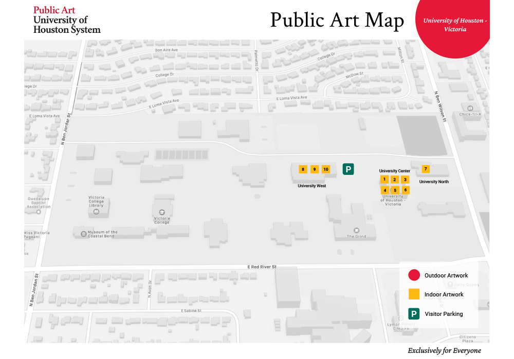
UHV map before + after
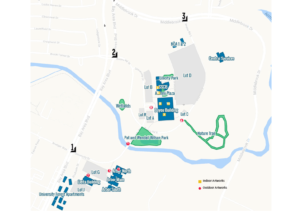
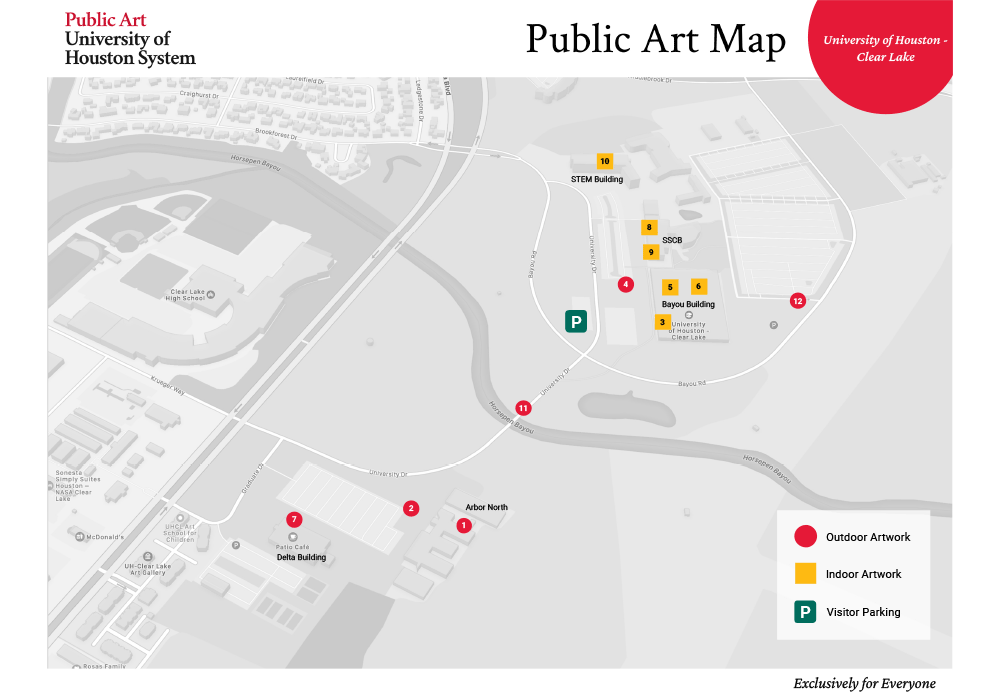
UHCL map before + after
