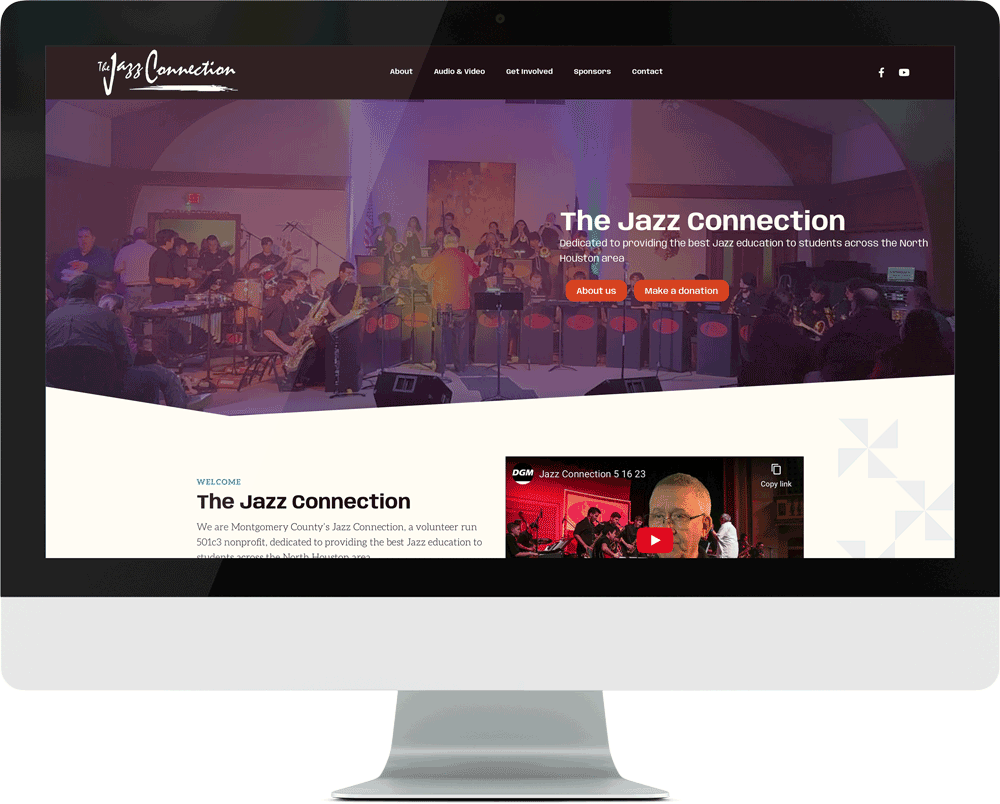
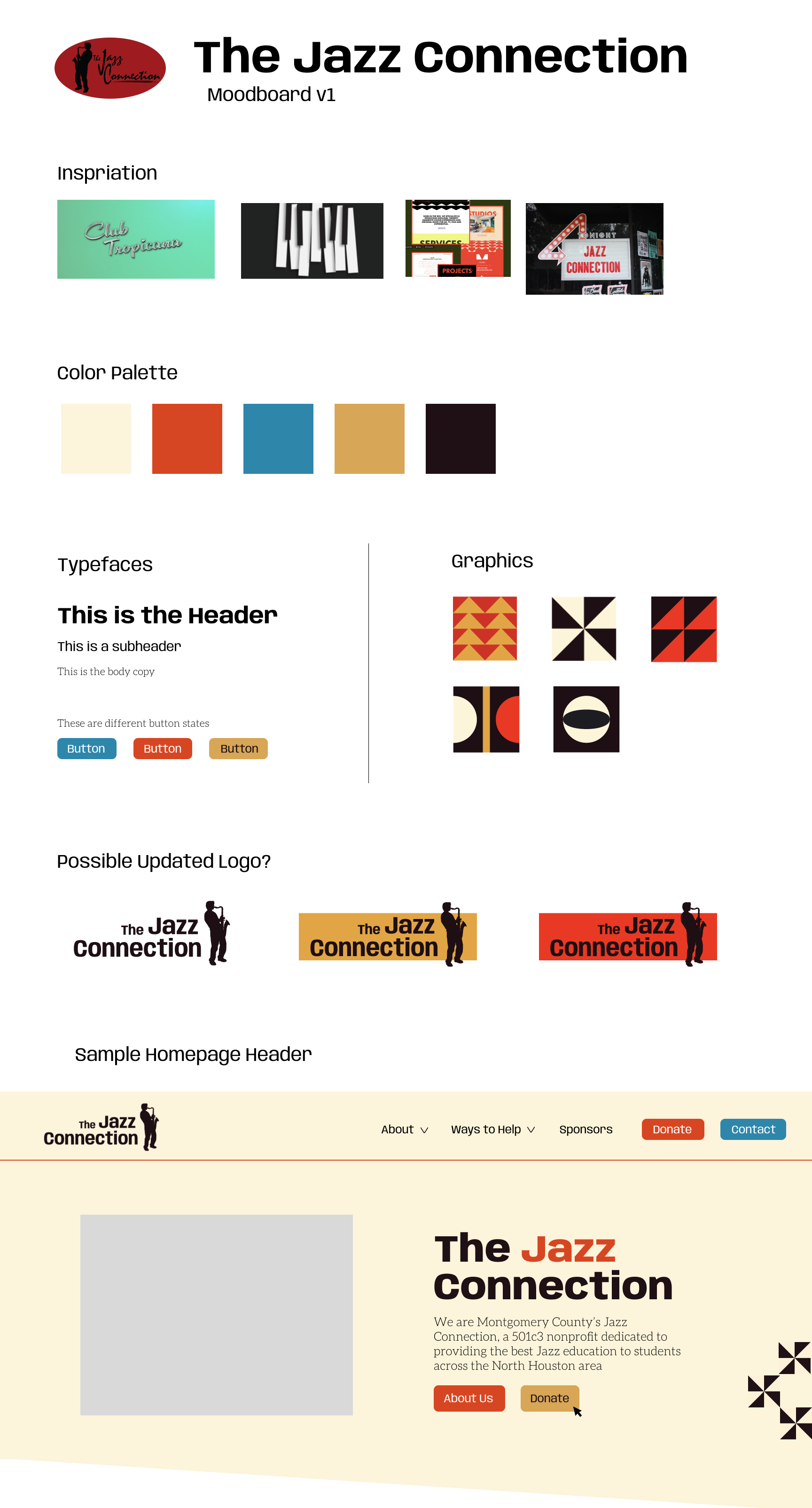
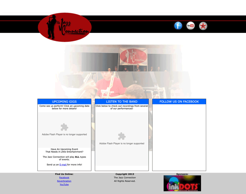
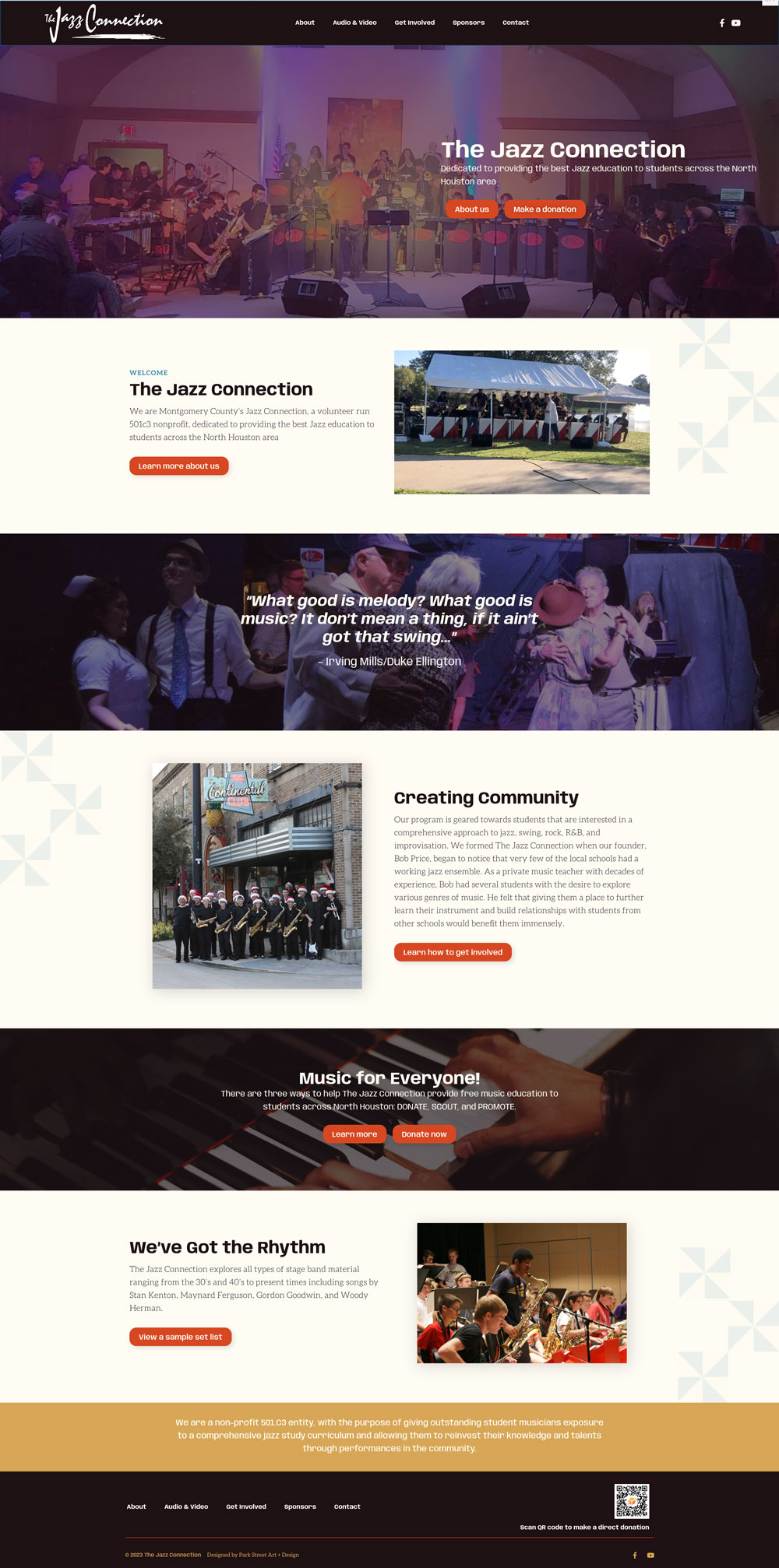
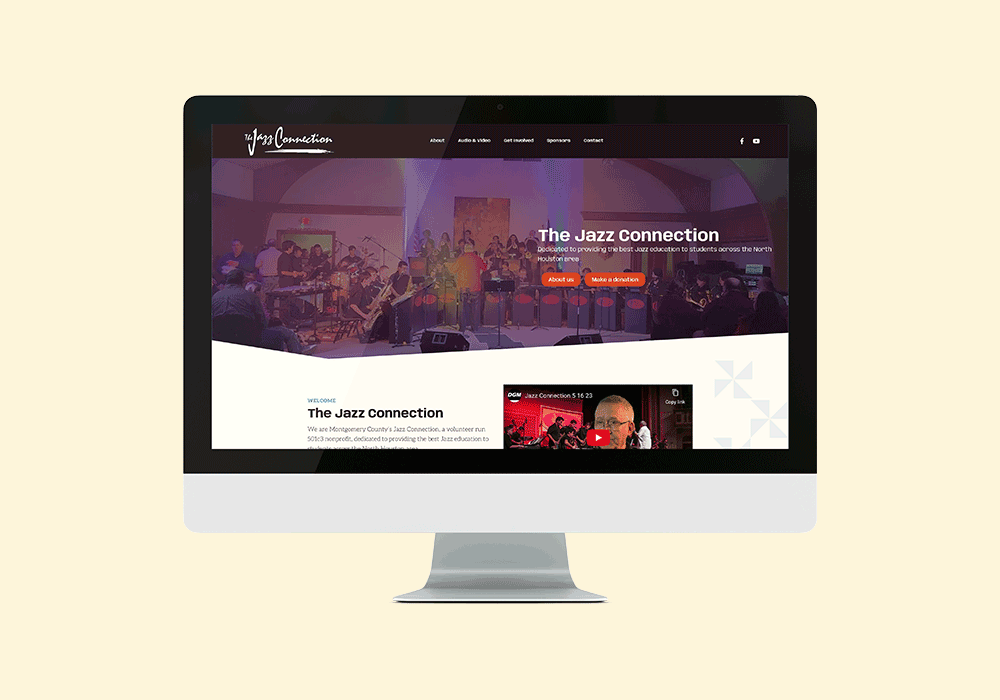
[2023] The Jazz Connection was in need of a major update to their online presence. Their old website had flash plugins that were no longer supported, in addition to a dated design. Bob Price (founder) gave me creative freedom to create something modern, lively, and easy to use. The Jazz Connection plays Big Band style of jazz and that is where I took my design inspiration from. I created a color palette from retro record covers, created a set of retro-retro-inspried graphics to use around the site, and a playful but legible typography pairing to round things out. In addition to the UI components of the site, I also acted as the UX designer, making sure that the user’s journey throughout the site is painless. Site built on WordPress.
Visit The Jazz Connection’s shiny new website here.
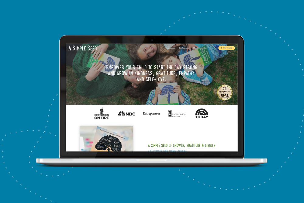
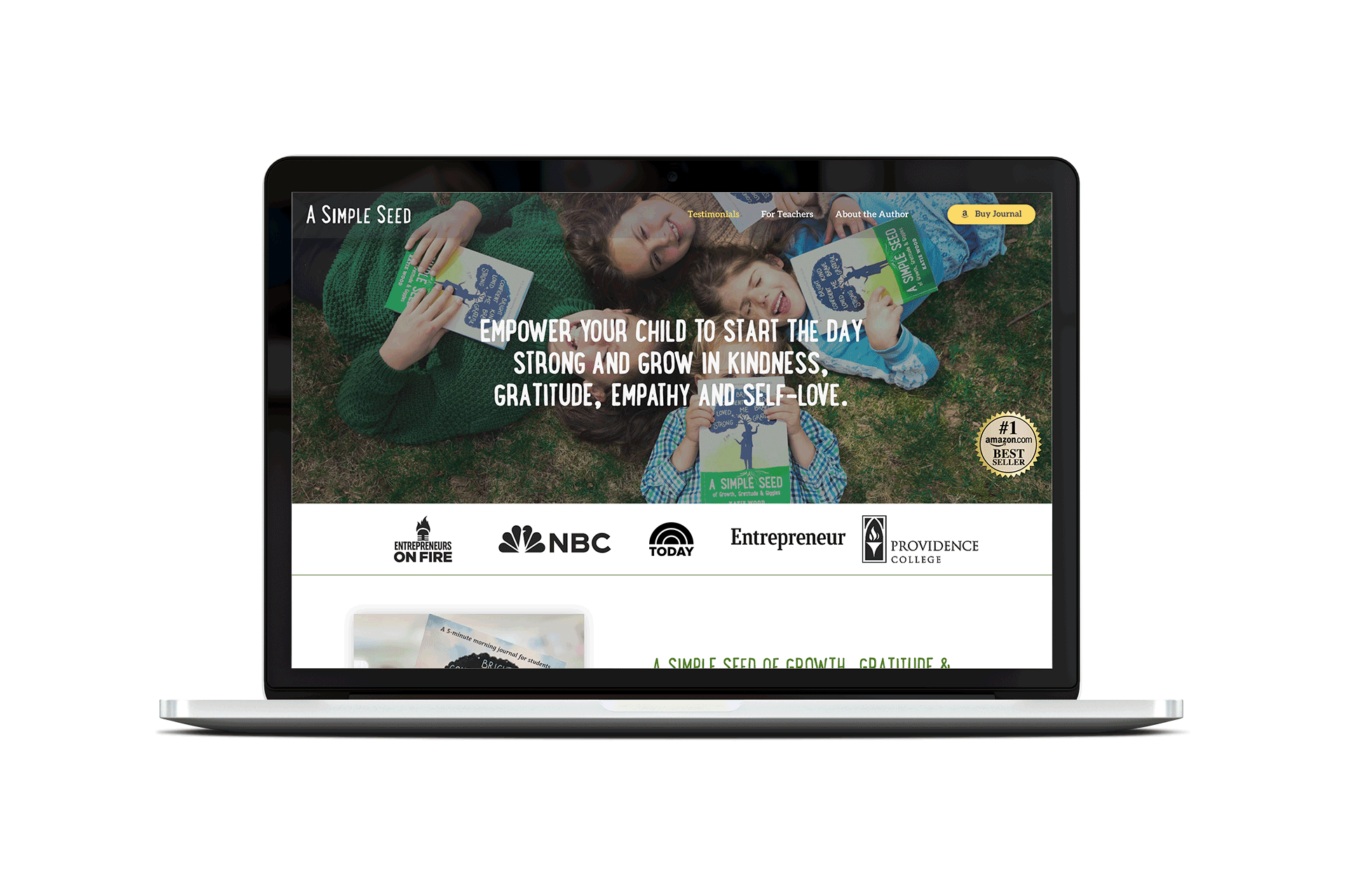
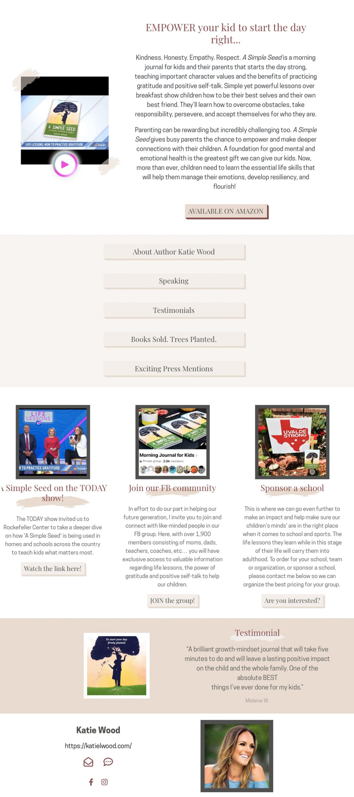
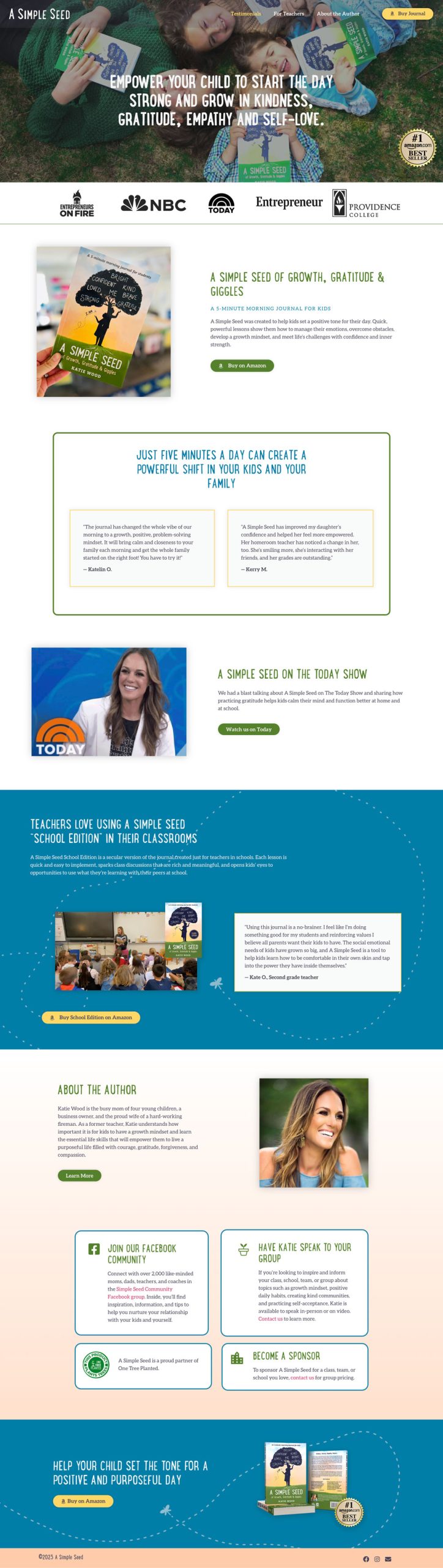
[2023] Another collaboration with Next Level Copy! A Simple Seed was looking to grow their online presence with a professional landing page for their mindfulness and gratitude journal for kids. Simple Seed’s major pain points were needing a clear marketing message and professional website design. I used the journal’s cover as inspiration for the design; this makes a direct connection to the physical journal, creating a clear and cohesive brand presence. Including little details, like the dragonfly path add a touch of whimsy thought out the landing page. And, as the brand grows, we will easily be able to grow the landing page to a full, multipage website. Site built on WordPress.
Mobile Views
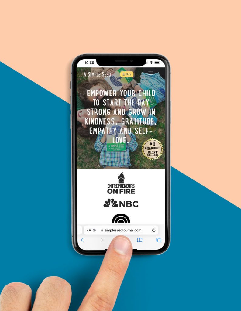
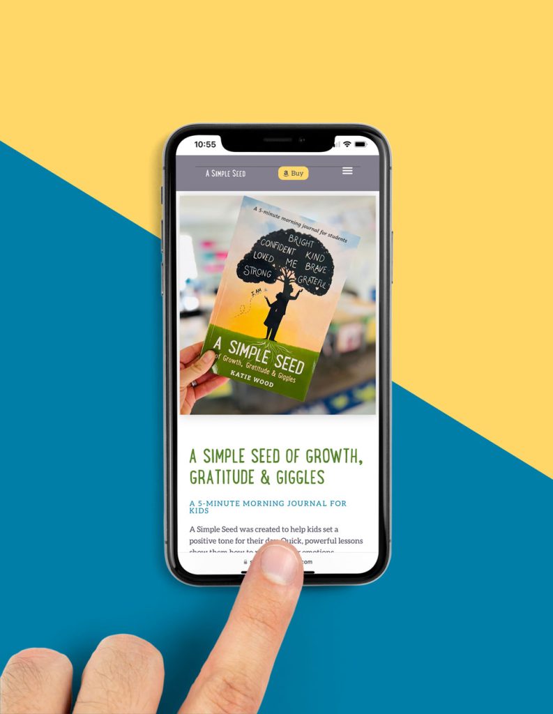
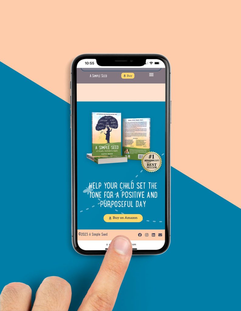
Visit A Simple Seed’s shiny new website here.
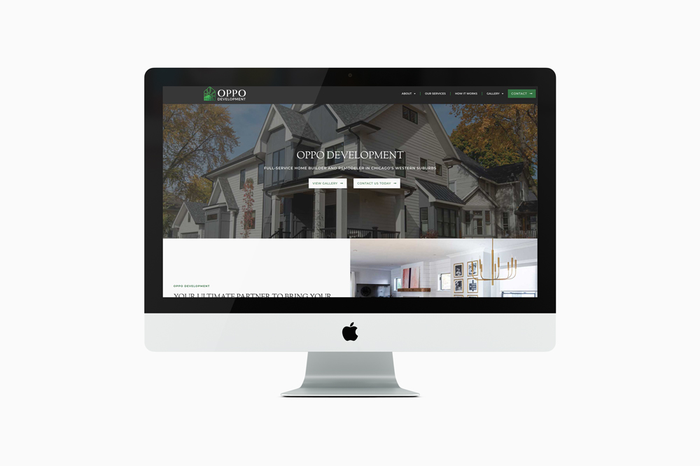
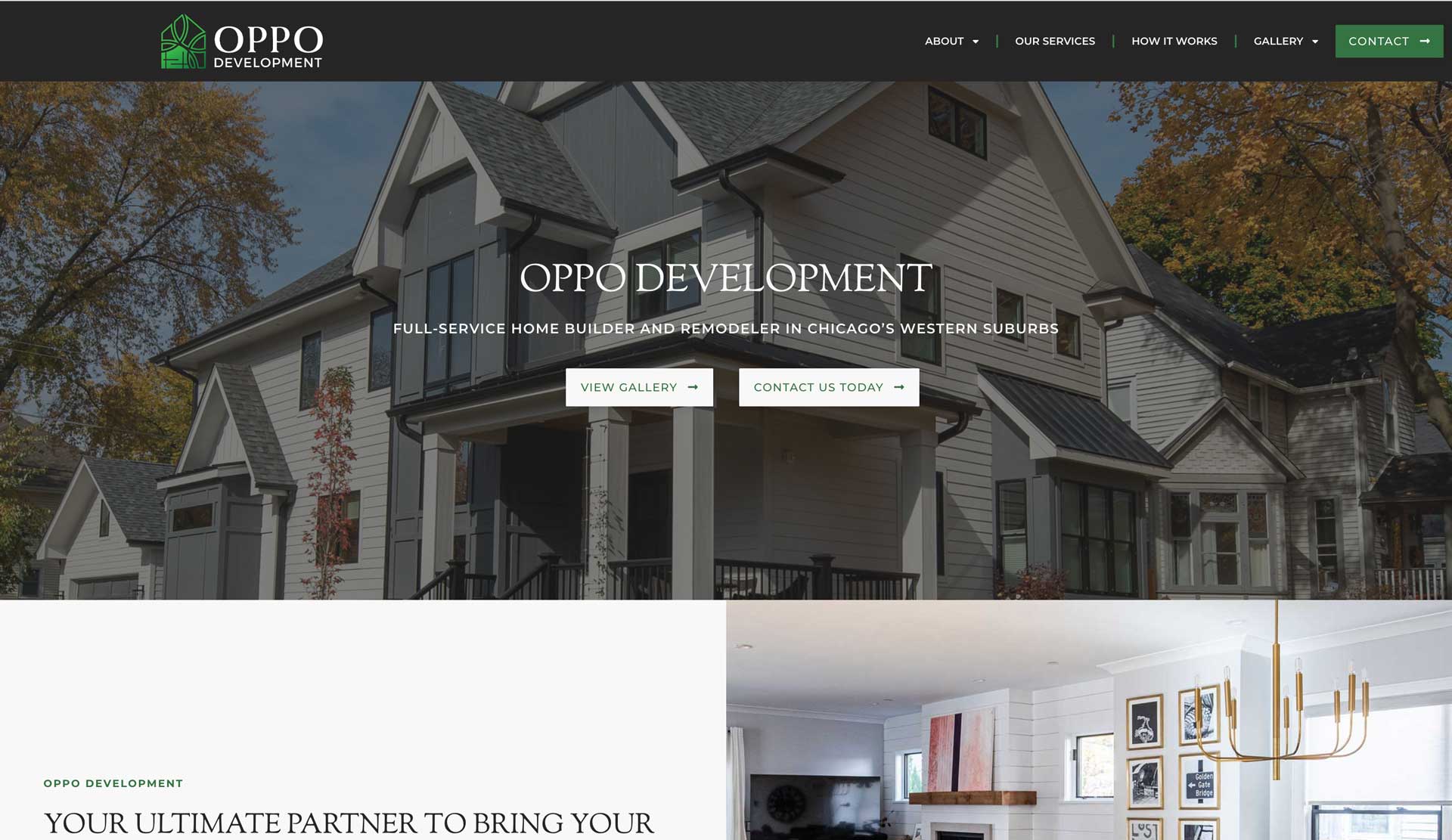
[2023] Another collaboration with Next Level Copy! OPPO Development wanted a new look for their website. While their current site was doing the job, they wanted to attract buyers and renovators in the luxury market. Taking OPPO’s established brand colors and typeface, we created an elegant and sleek website that complemented their modern home projects. We wanted to let OPPO’s work speak for itself by letting the photography be the main design element, and added an additional serif typeface to add a touch of elegance to the website’s design. From a UX perspective, the Services page was reworked and edited down to make pertinent information more accessible for the user. A “How it Works” page was also added to better help explain the process to interested home owners. Site built on WordPress.
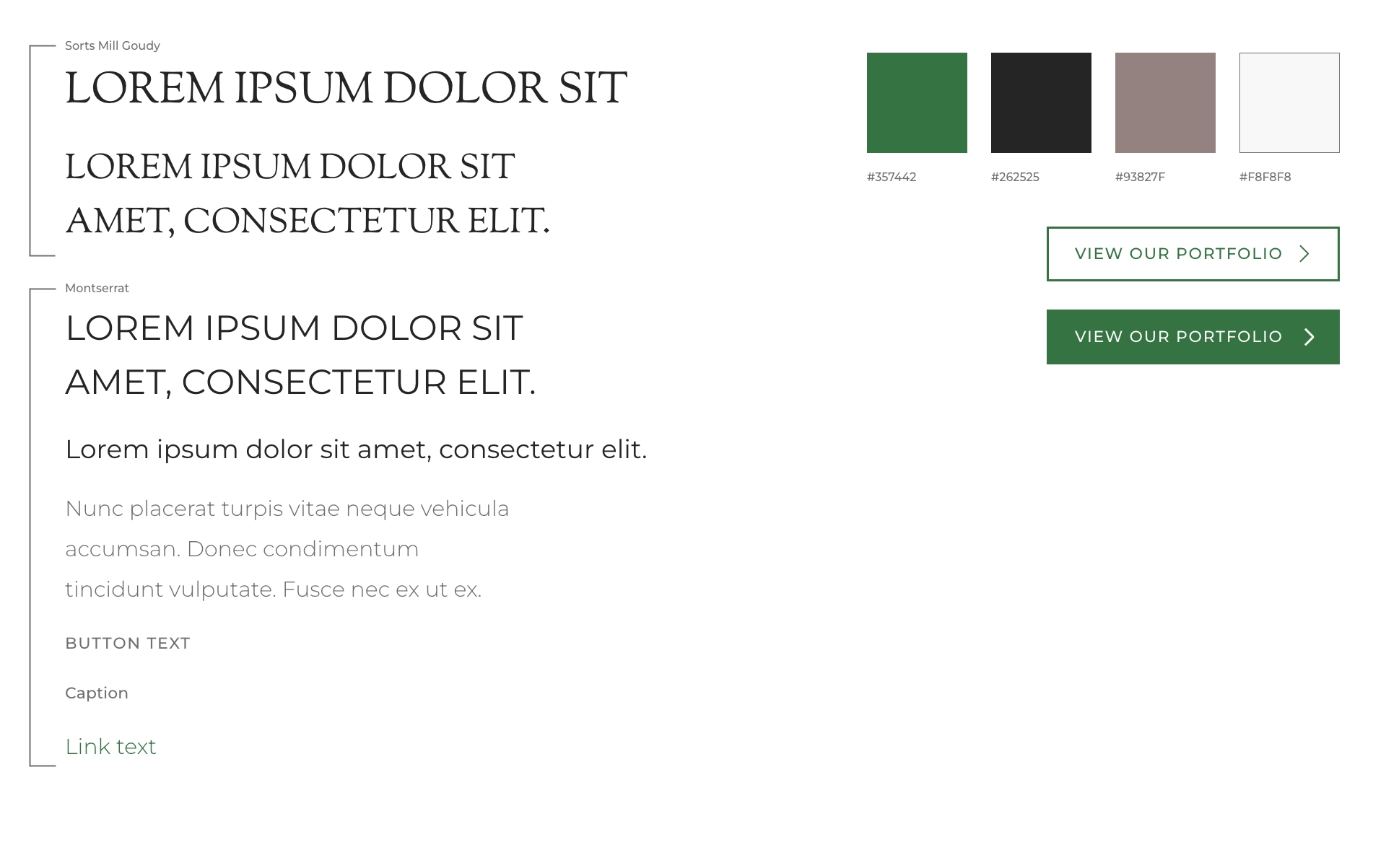
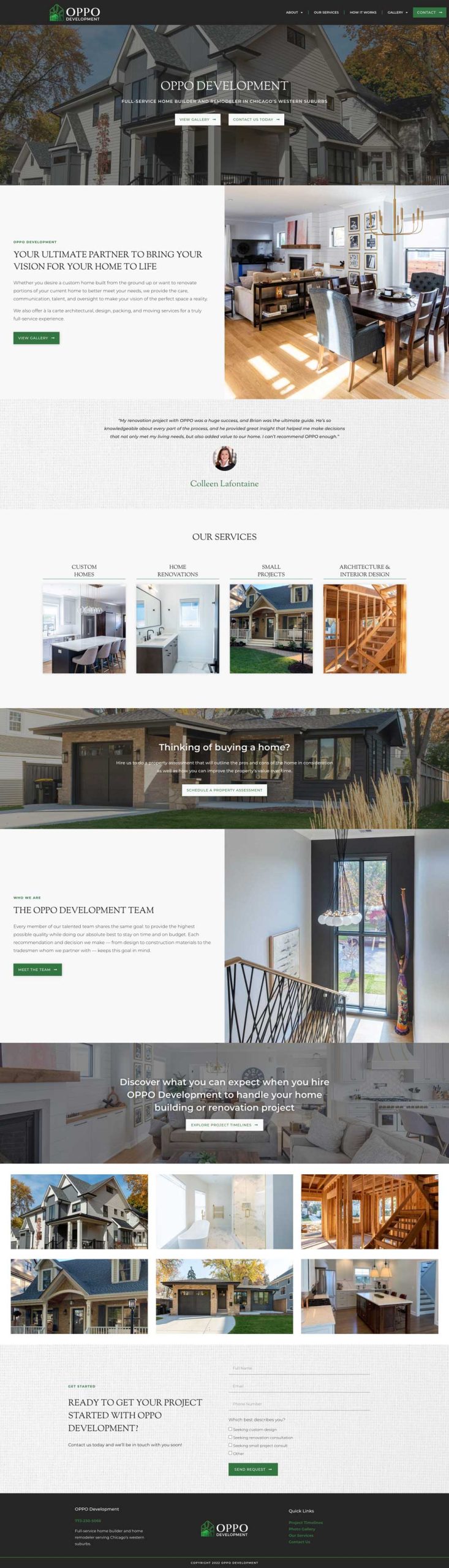
Visit OPPO Development’s shiny new website here.
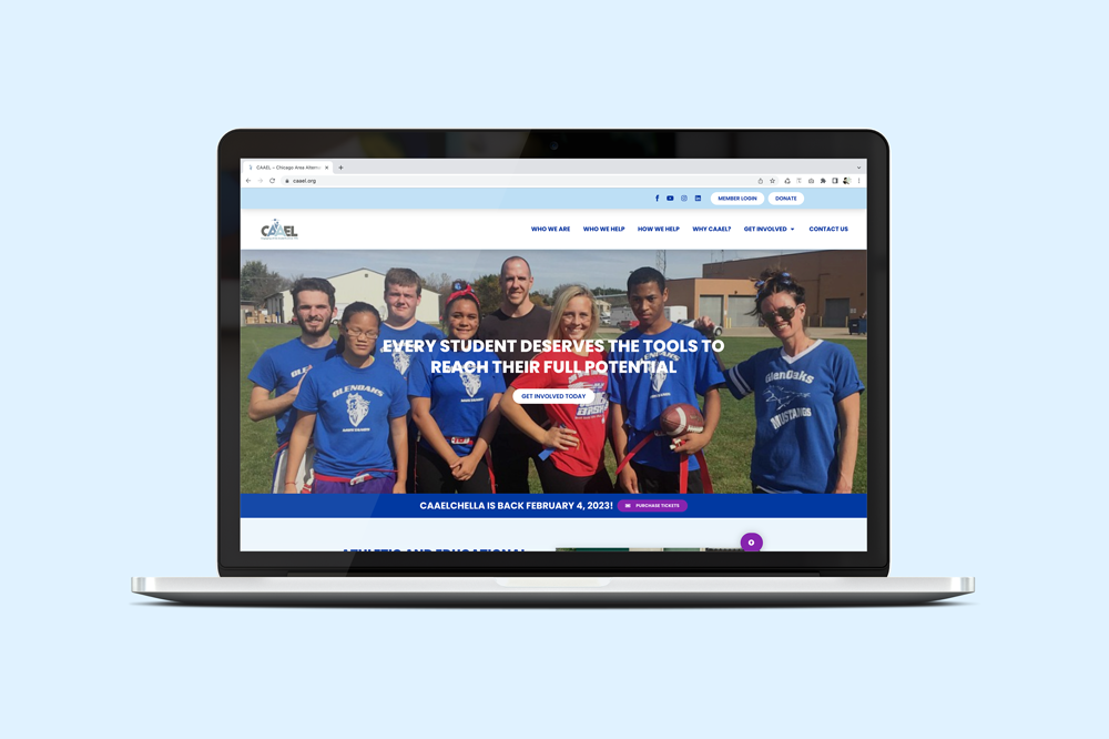
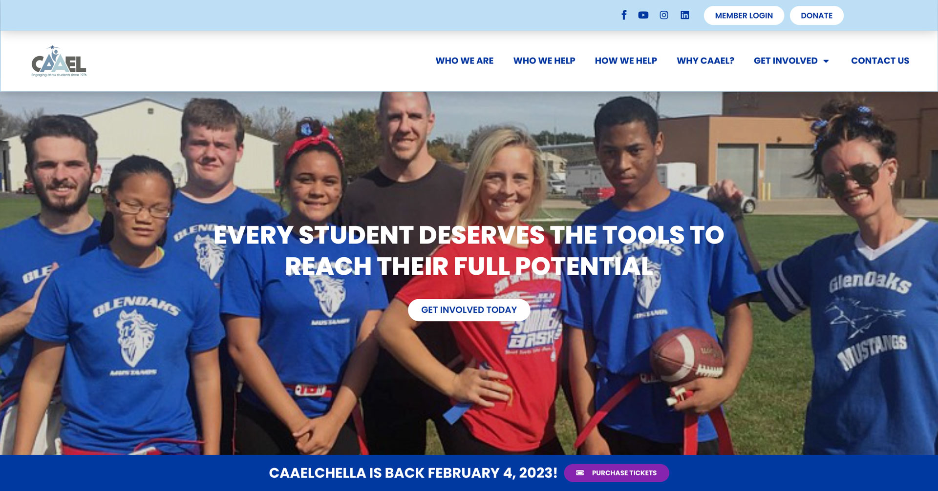
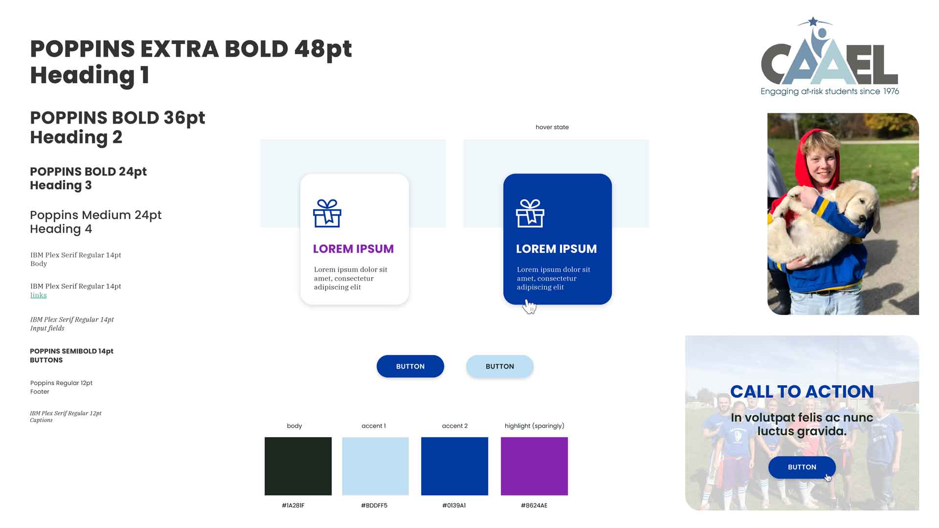
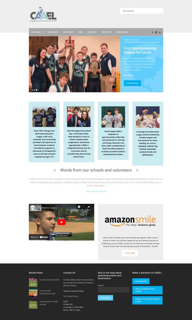
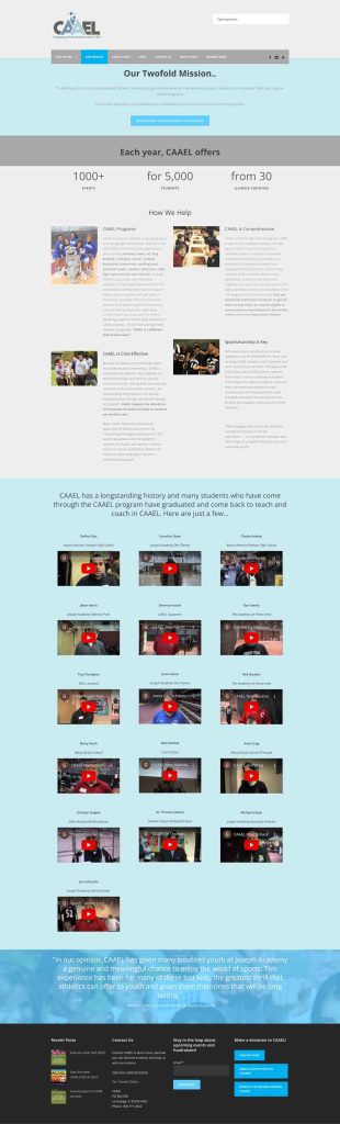
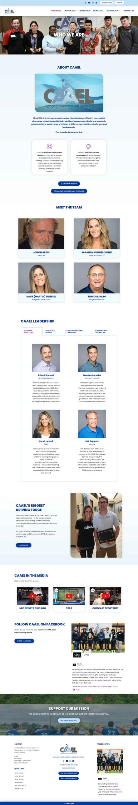
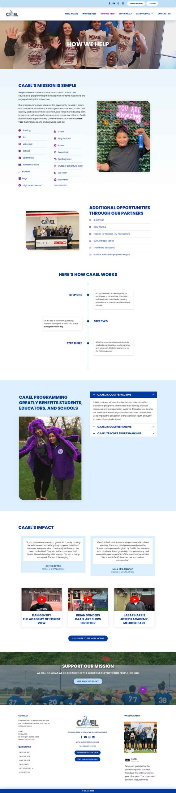
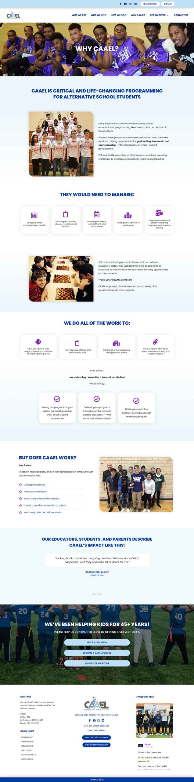
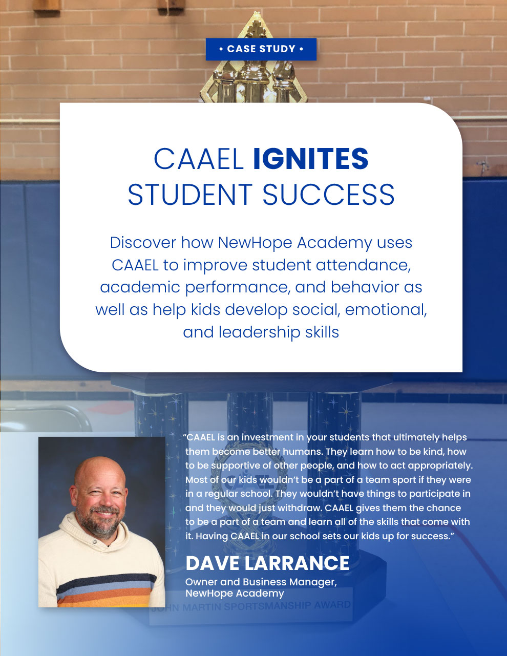
[2022] Another collaboration with Next Level Copy! CAAEL, a nonprofit based in the Chicago area, was in need of an entire brand and messaging overhaul. Knowing this would help their mission, we excitedly signed on. Dana and I helped CAAEL understand their prime audience (donors), analyzed their current website and picked out the most essential information that potential donors would want to see. We worked through the site architecture, wireframes, and mockups, all the way through to the final WordPress design implementation.

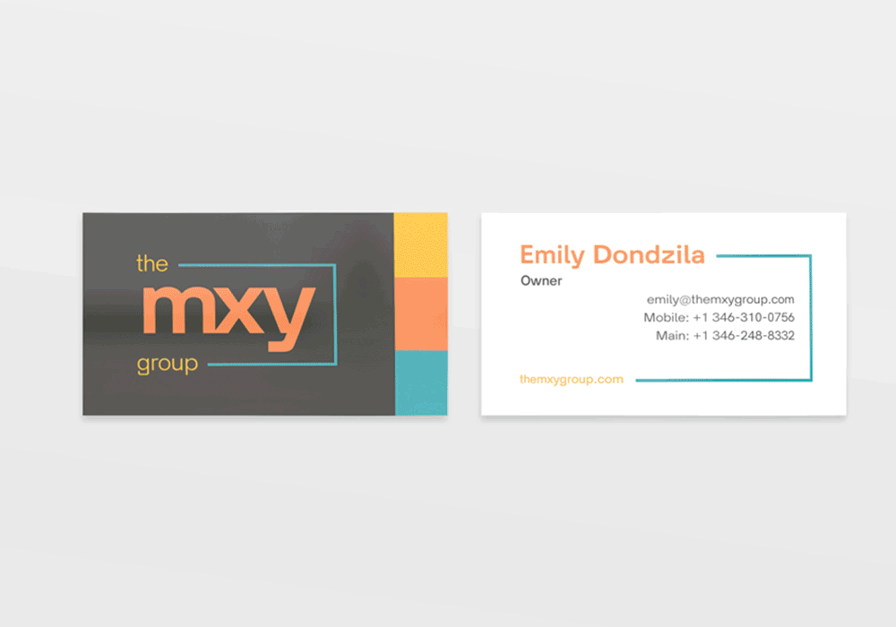
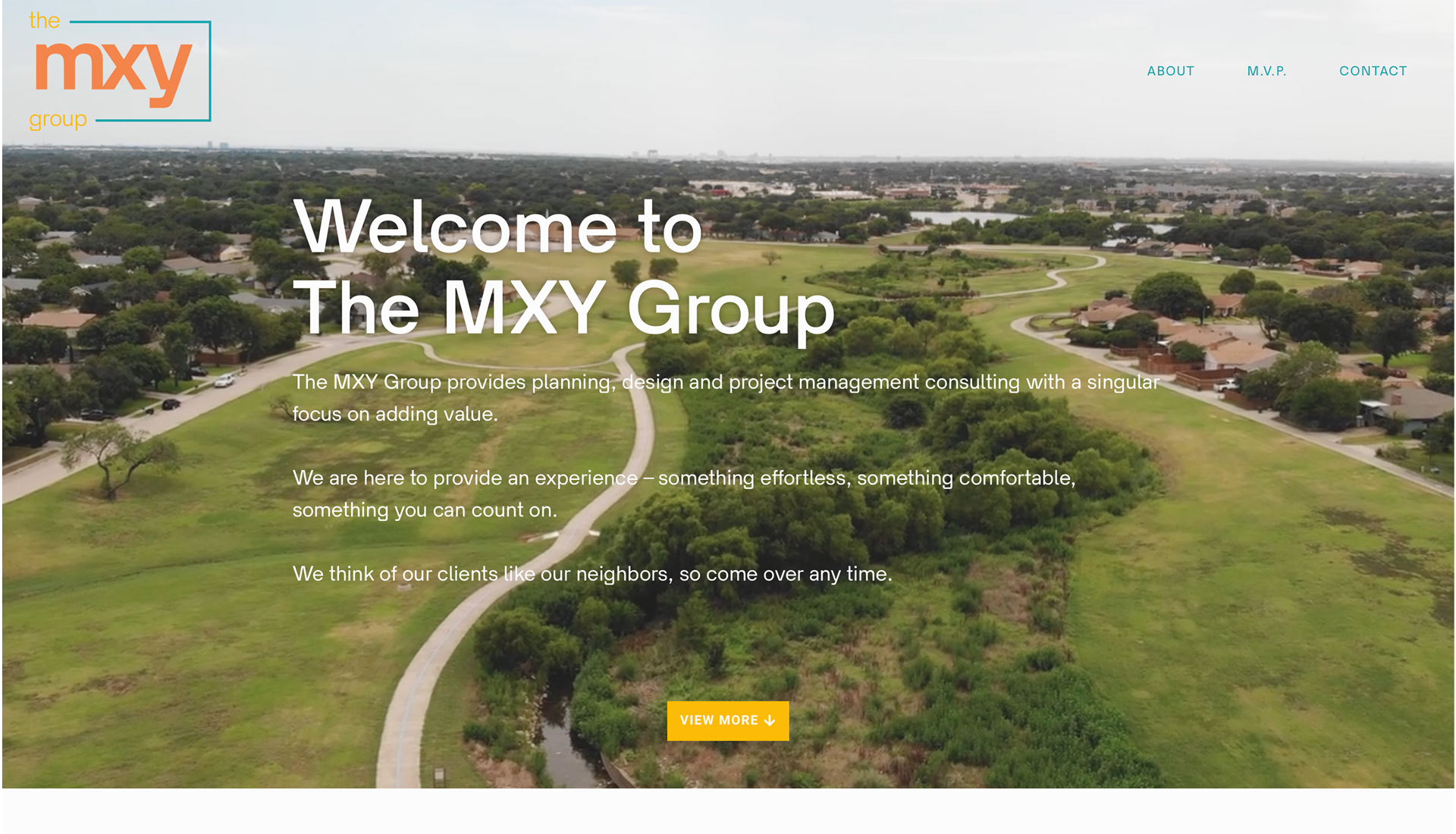
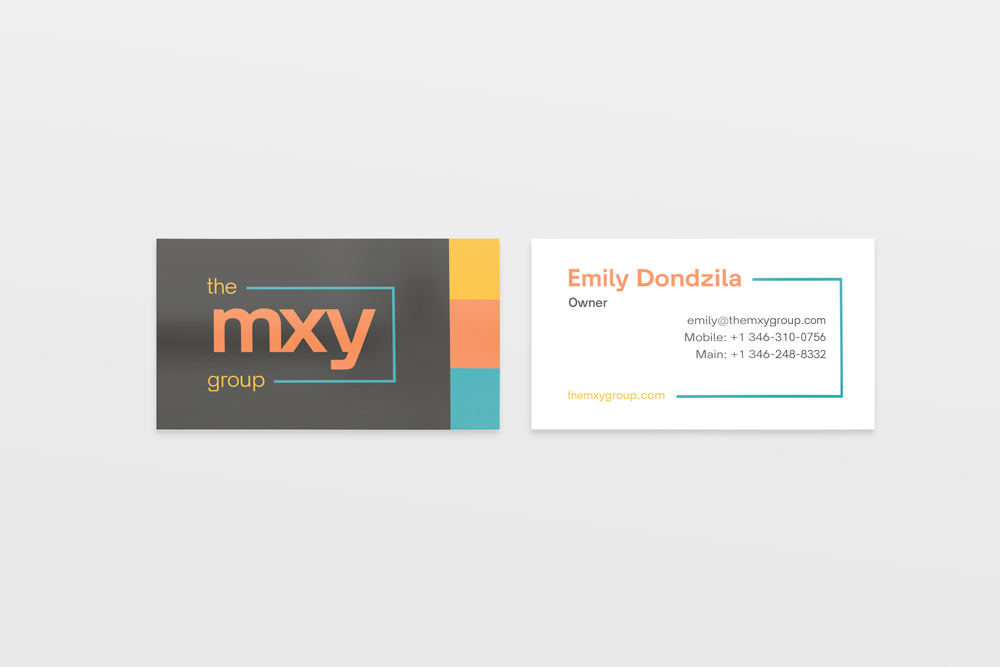
[2021-22] Emily, the principal engineer from The MXY Group, came to be needing the whole package: logo, business cards, and a website for the new engineering business. After a deep dive phone call and some light homework on Emily’s behalf, we nailed down the vision for the new business: reliable, hometown friendly, but with a wink. You know, MOXIE! We chose a playful color palette and a typeface with personality and tied them together into a clean website that is easy for their clients to navigate. It was also important for the stakeholders to have a website that will grow with the company–there are plans to build out a projects section once they have more use cases under their belt. Site built on WordPress.

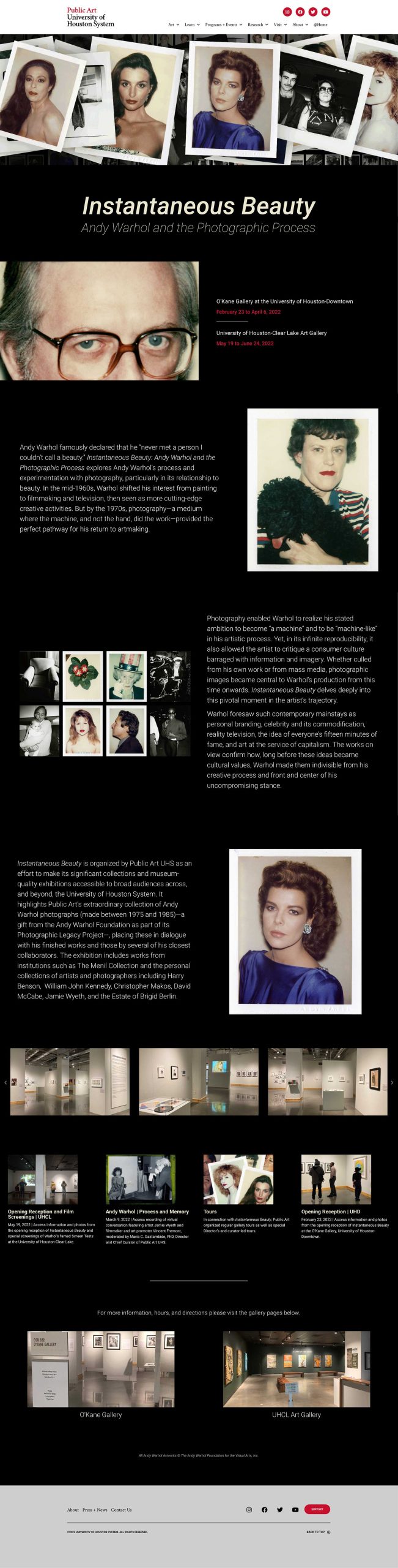
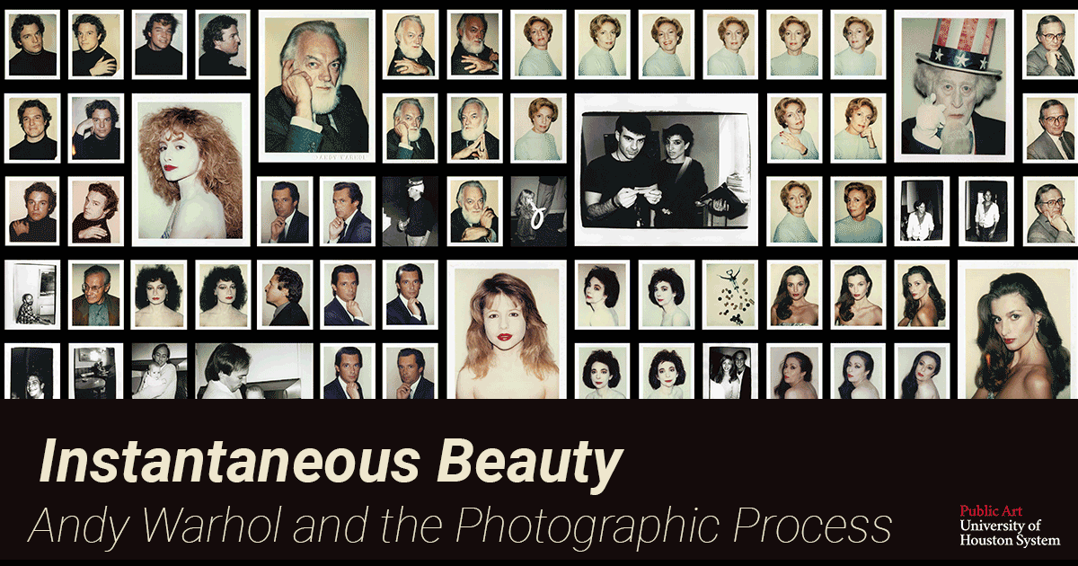
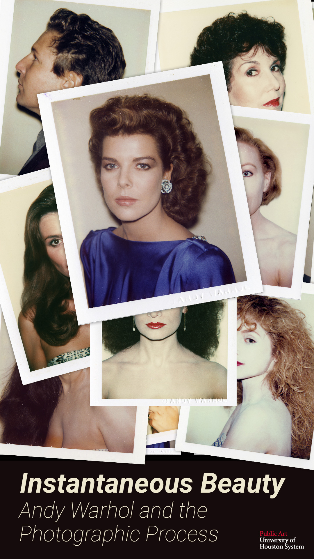
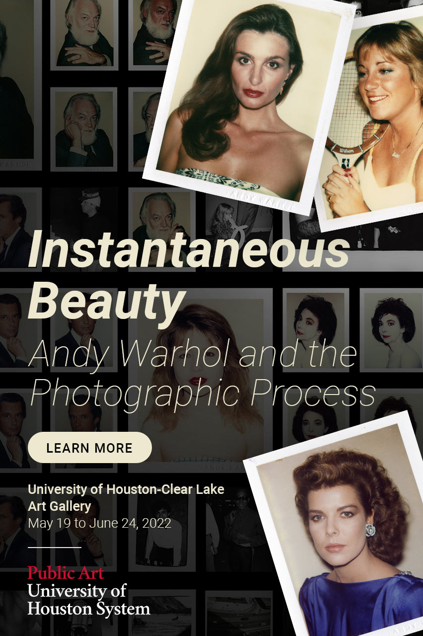
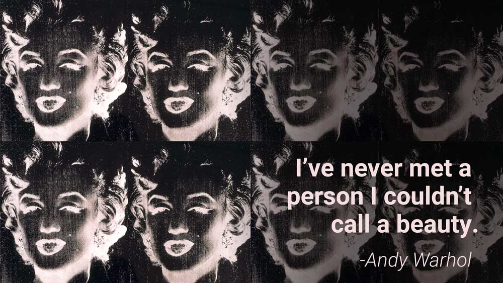
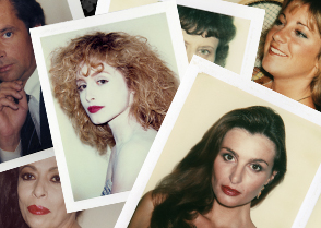
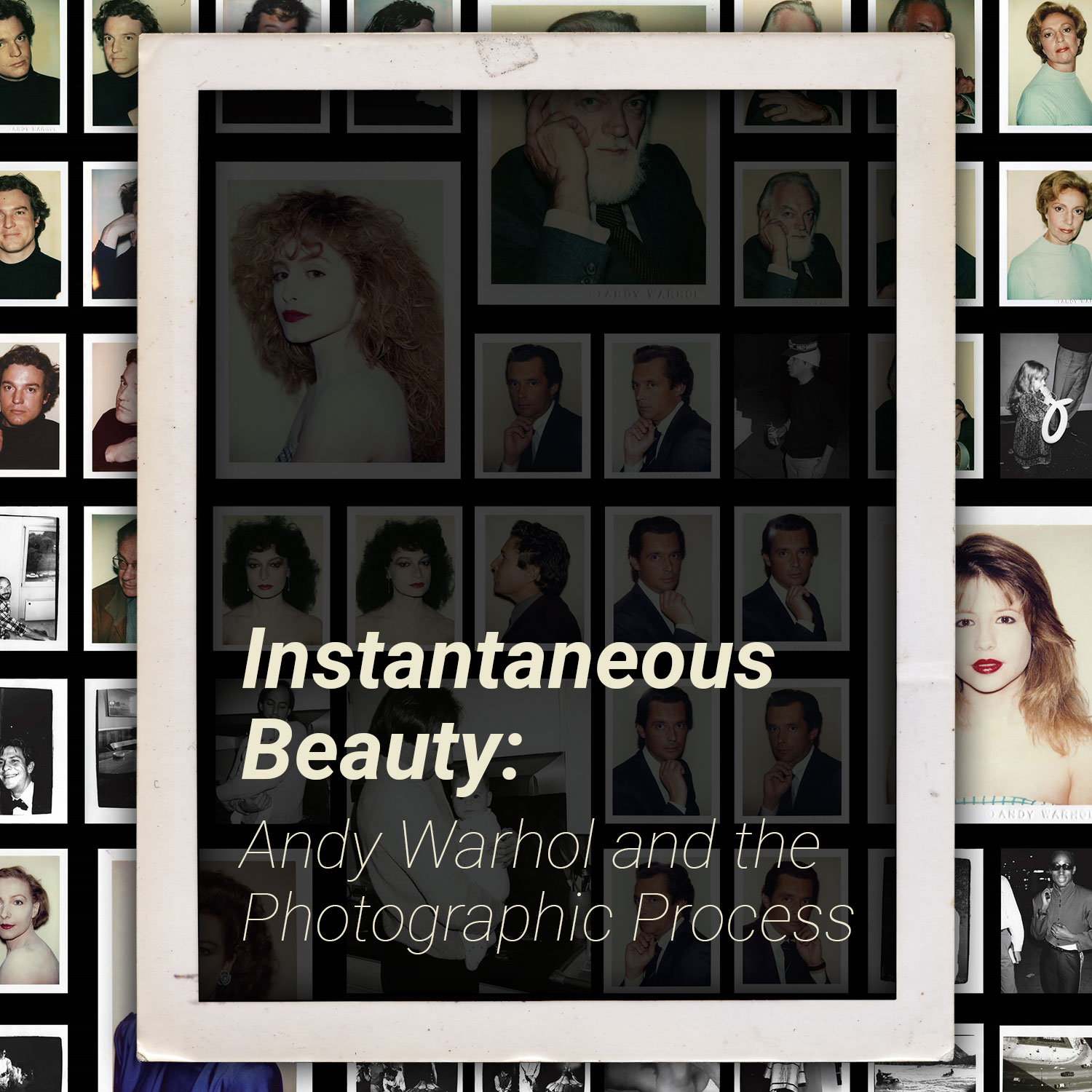
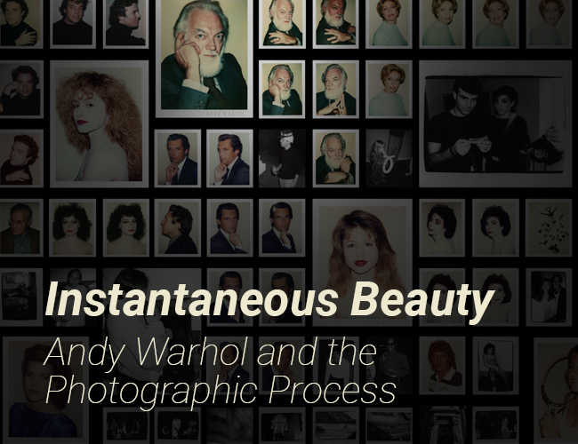
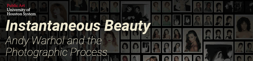
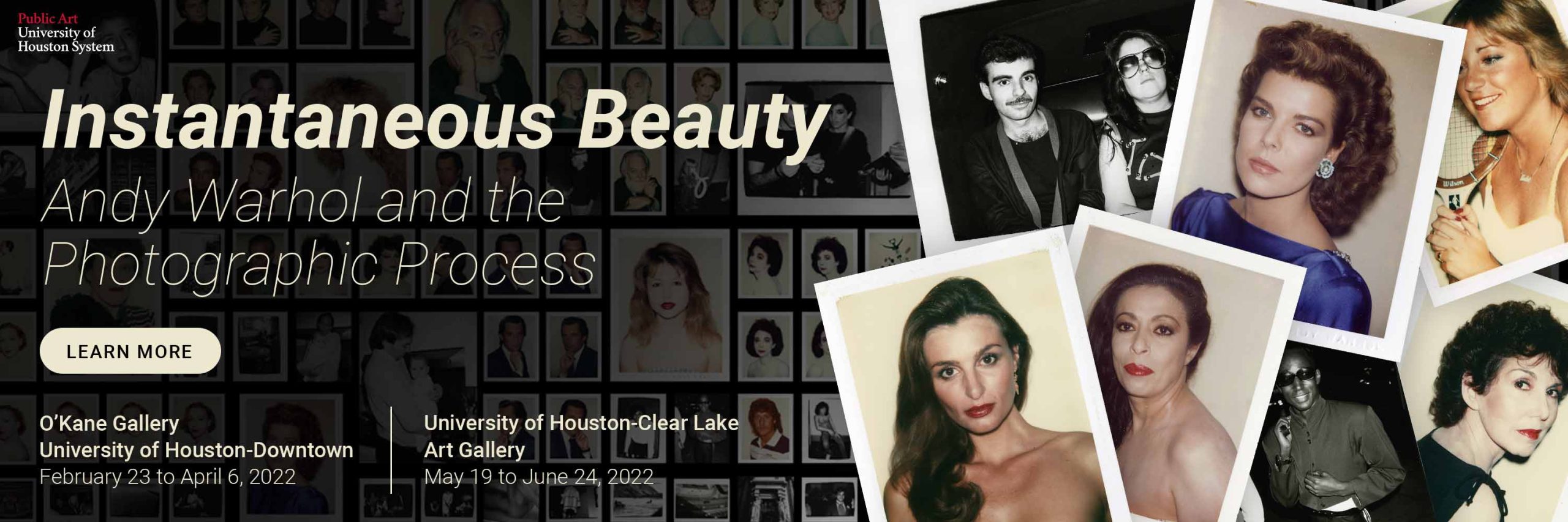
[2022] Working with the Public Art department at the University of Houston (PAUHS) was a dream! We collaborated on many exciting projects, including the brand identity for the Warhol Exhibition, the visual identity for the Art on Screen annual film festival, and recreating the public art campus maps for cohesion across all five campuses.
I was also the web content manager for the PAUHS WordPress website. My first project was to audit their entire website and make the necessary edits to make sure there is cohesion throughout the site. I created a hierarchical set of typography rules for all titles and body text, ensured all links were hot and cohesive across the board, and created and/or updated graphics and images for consistent use across the site. Once the audit was complete, I continued with content updates and page builds as needed.
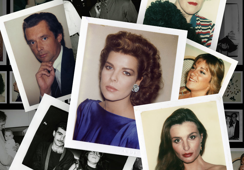
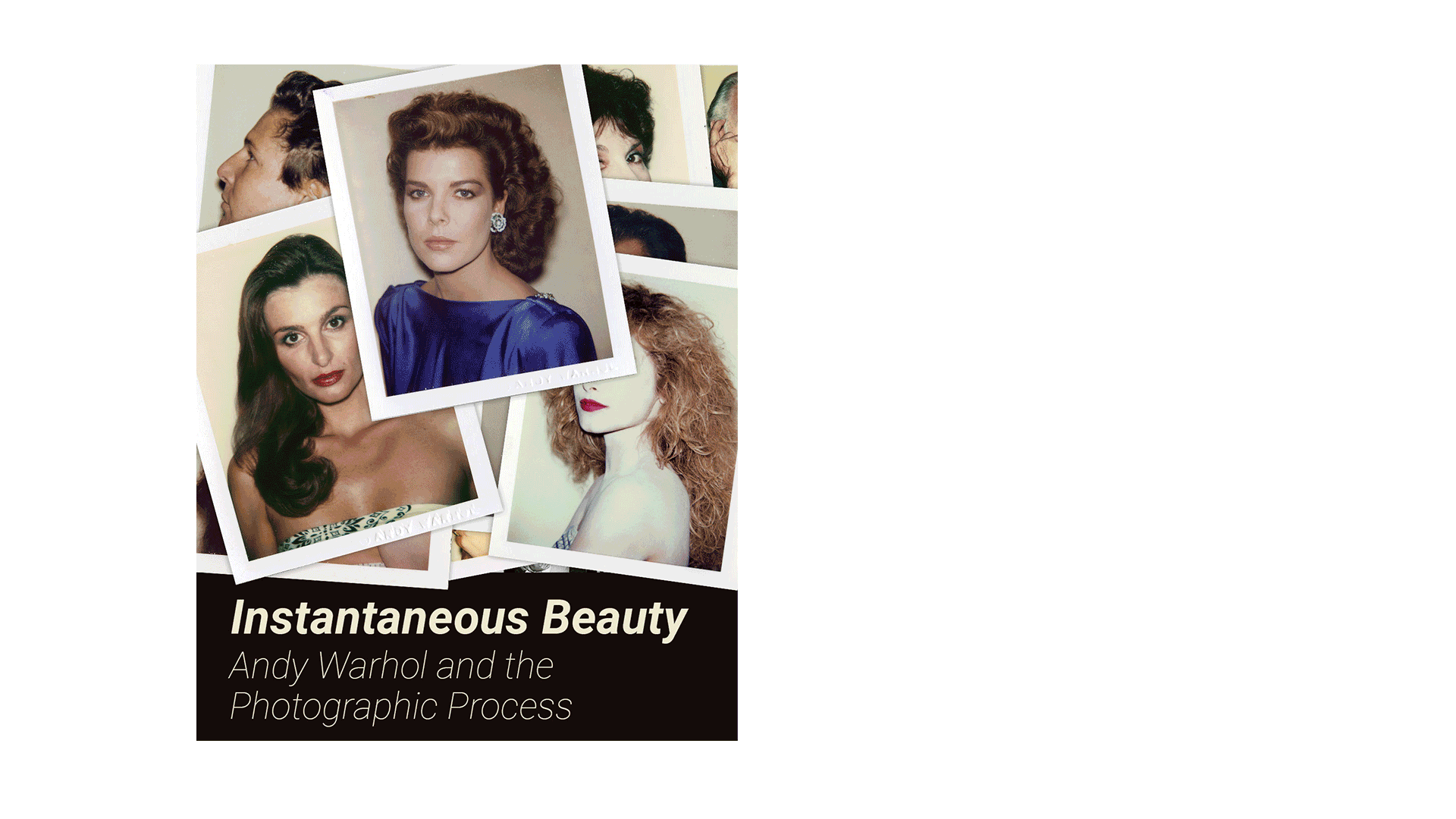
Developed and implemented the brand identity for Instantaneous Beauty: Andy Warhol and the Photographic Process, the exhibition of Andy Warhol’s Polaroid images across two University of Houston campuses. Taking a Polaroid is a quick action, usually tossed on a table to continue developing, I wanted to recreate this feeling in the visual identity by using gifs and recreating piles of photos wherever I was able. This was a huge project for Public Art – we created graphics for online advertisements, social media, newspapers, and for the PAUHS website. I also created a custom landing page for the exhibitions.
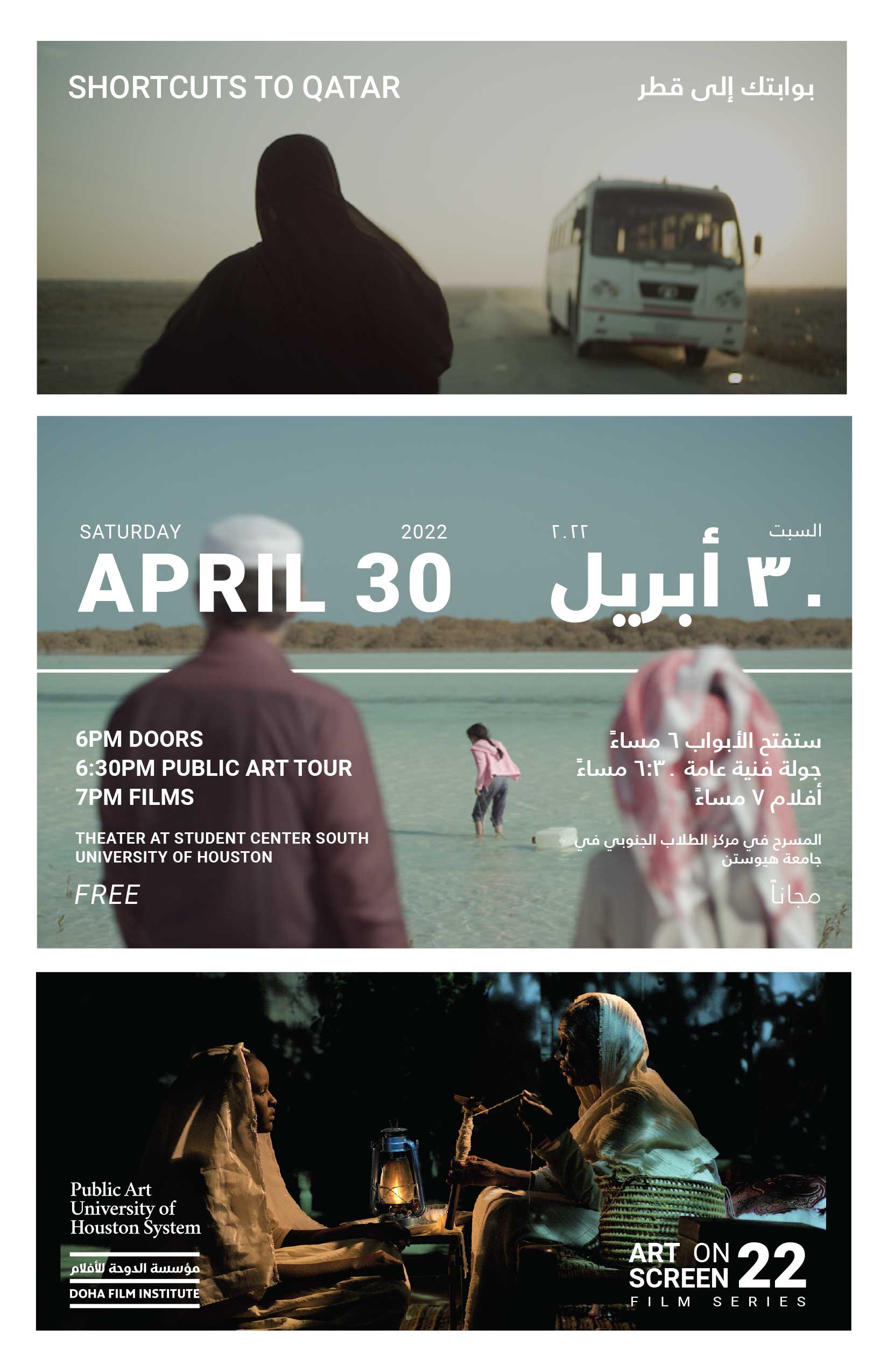
The Art on Screen Film Series is an annual themed event put on by PAUHS. 2022’s theme was titled Shortcuts to Qatar, featuring short films by filmmakers in Qatar. I chose to use film stills from three of the films, picked specifically because the faces are either somewhat obstructed or completely hidden–hoping to convey a feeling of intrigue to the viewer. I was lucky to be sharing studio space with a graphic designer from Qatar, who kindly provided the Arabic translation and helped me learn about Arabic language conventions and how it is displayed alongside English.
A poster, yard signs, social media assets, and digital signage graphics were created for the event.
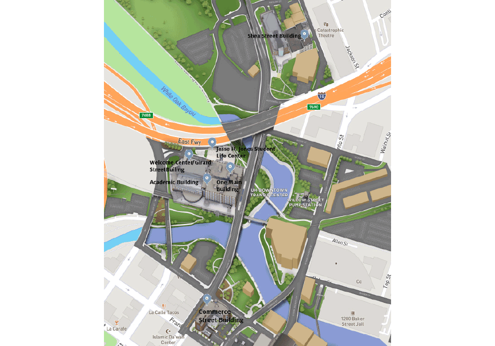
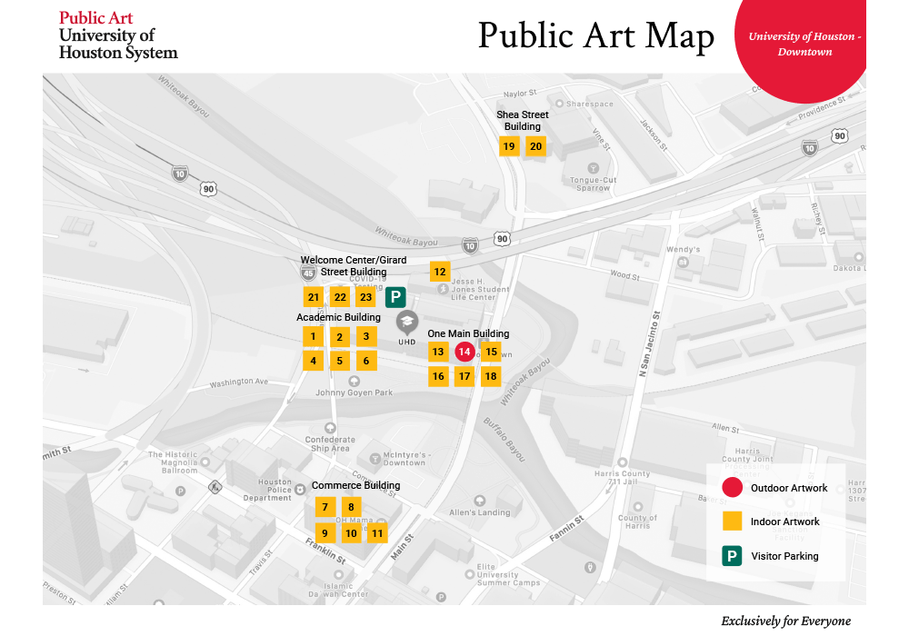
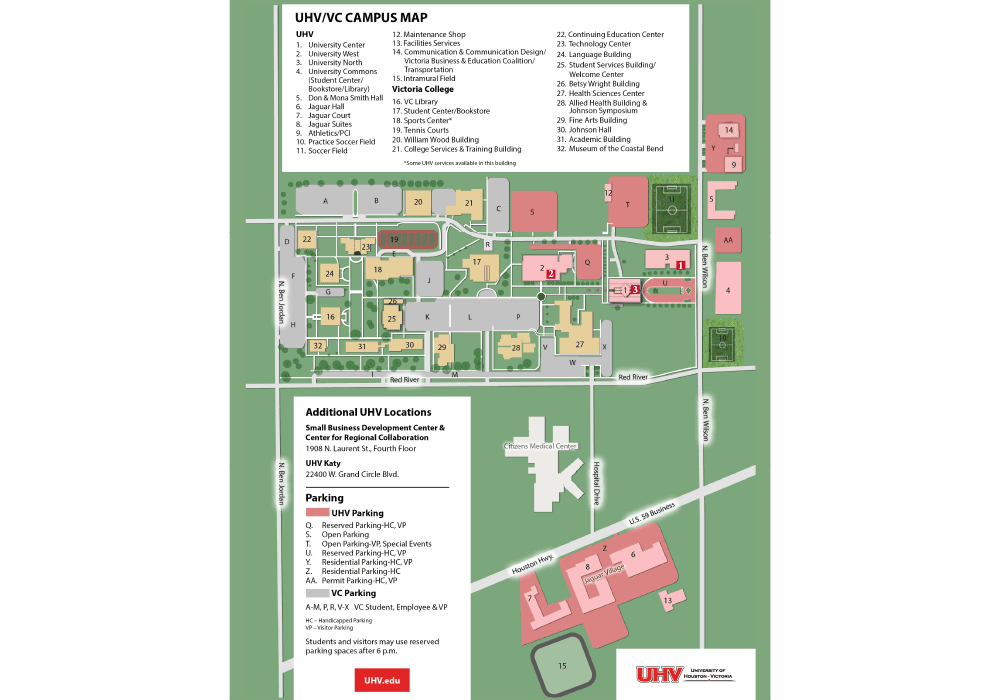
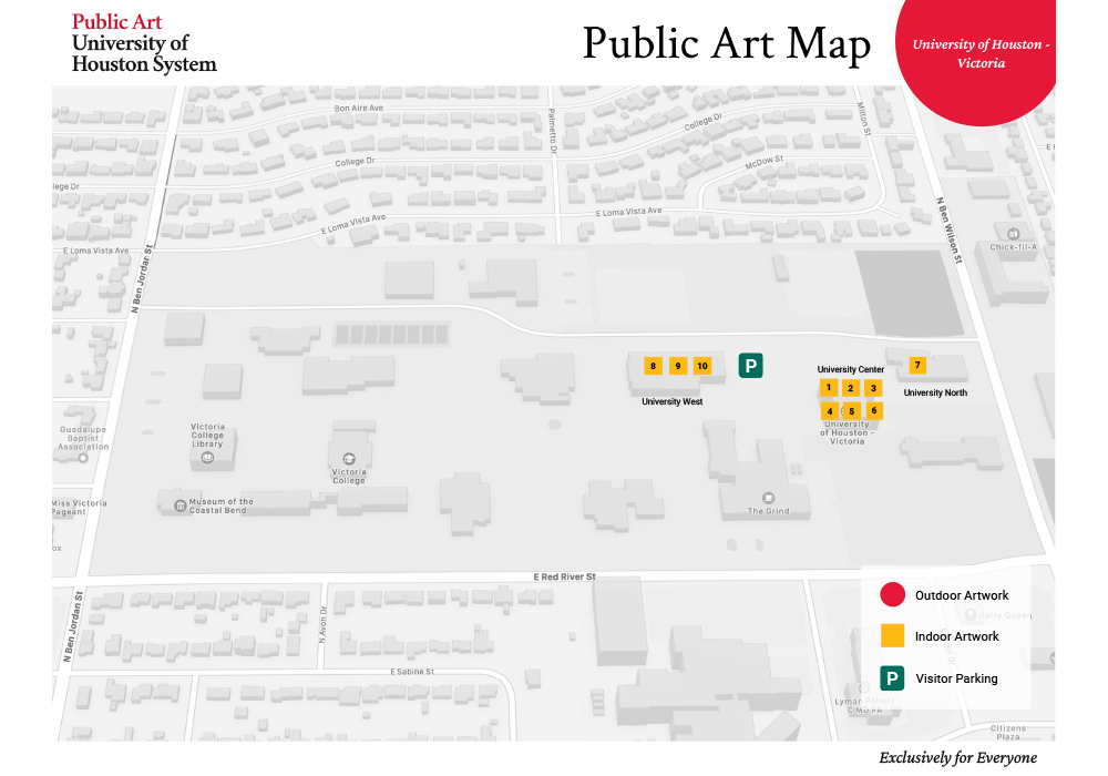
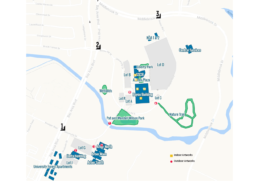
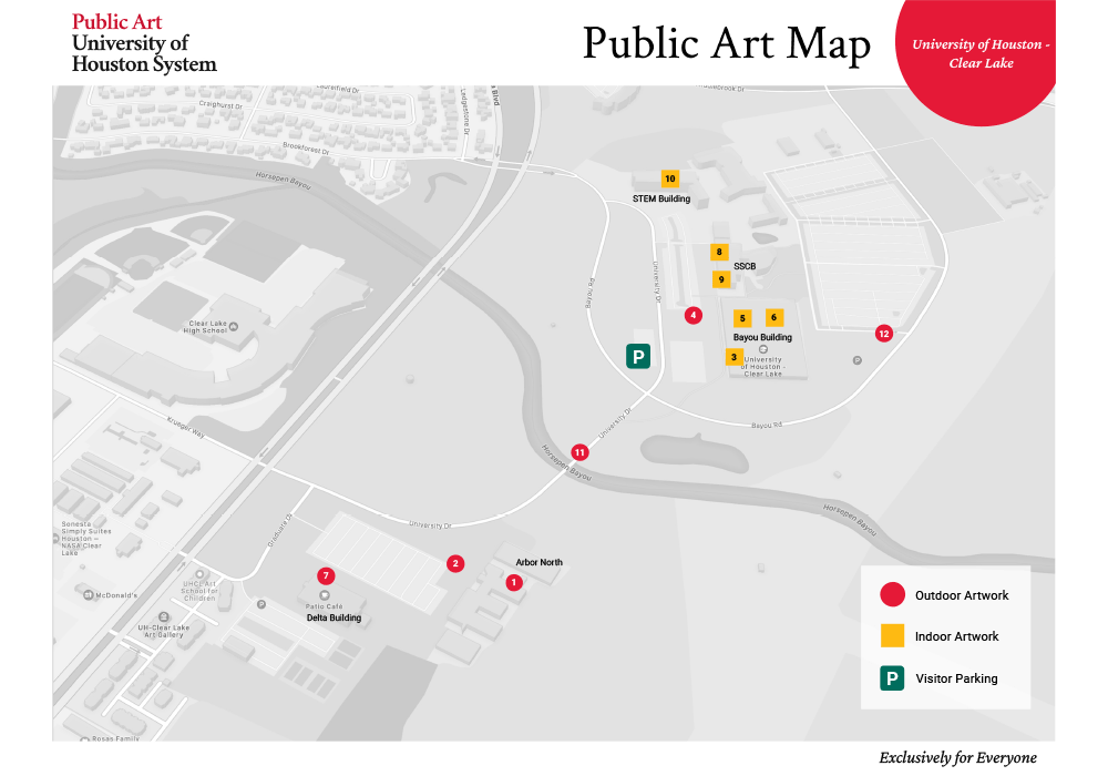
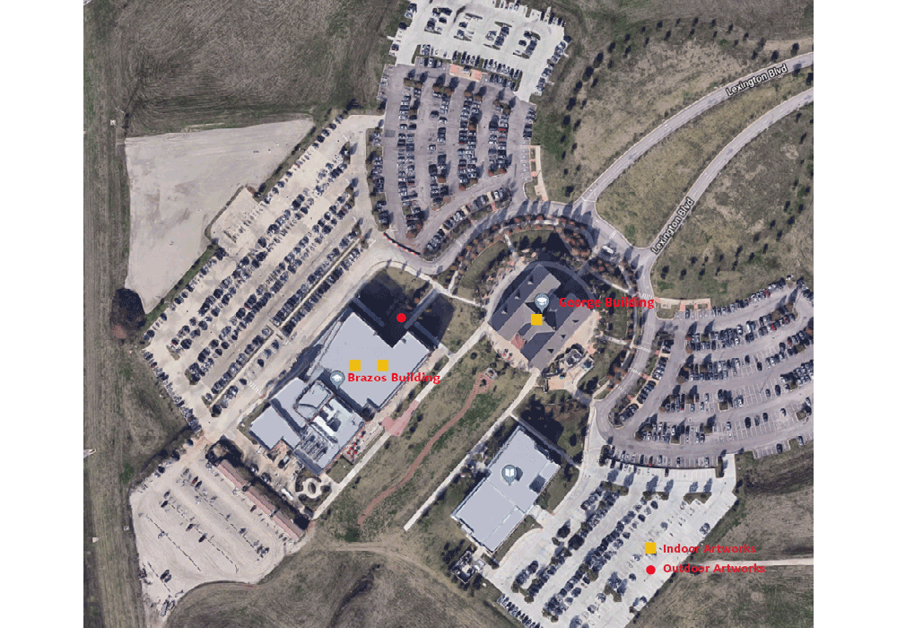
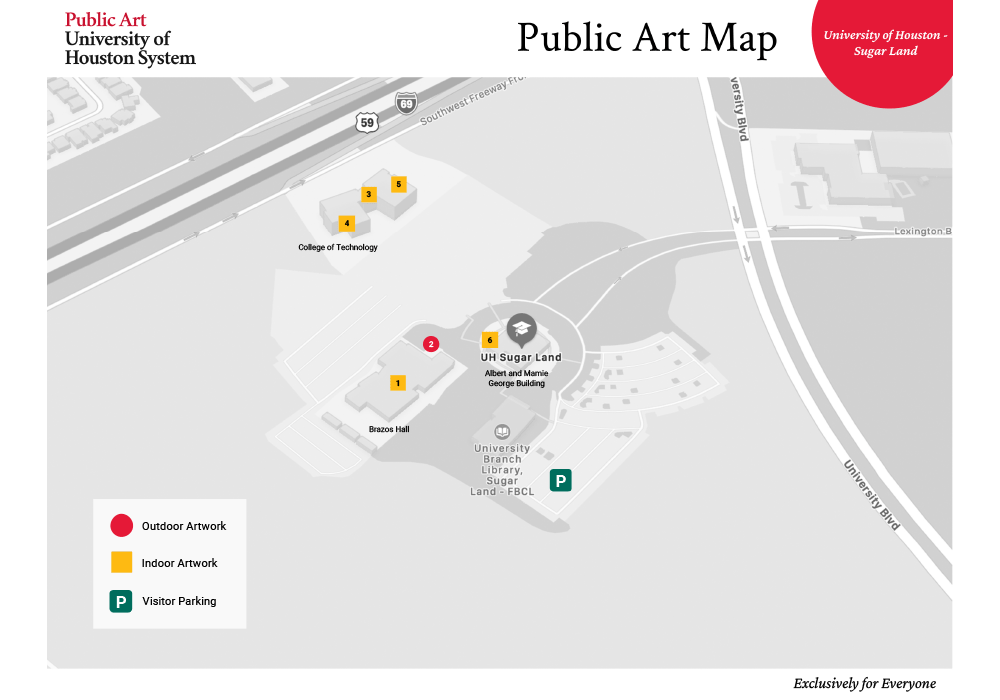
I know, campus maps might not be the most exciting designed object to show, but I love a good design problem and this was a fun one to tackle. The UH main campus already had a great campus map designed for all of their public art, but the other four campus maps lacked consistency and hierarchy. In addition, the public art office did not have access to the maps, which was a pain point for them when they needed to add new artwork or edit a piece when it goes to conservation.
Using the main campus map for consistency, I created new map templates for all four campuses from scratch, ensuring they all used the same design system so viewers knew that all campus artworks were, in theory, a unit, even though they are spread out over Southeast Texas. We added the PAUSH tagline “Exclusively for Everyone” to each map to further the messaging of their brand. Most importantly, I created the maps in Photoshop so they, or another designer, would be able to edit the maps in the future. Full maps (with interiors!) can be viewed here.
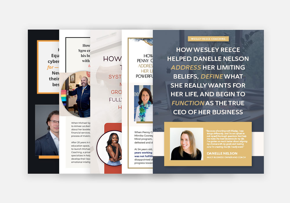
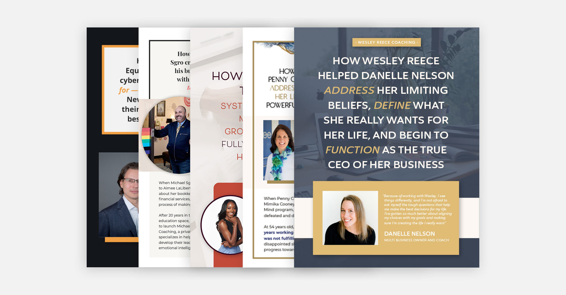
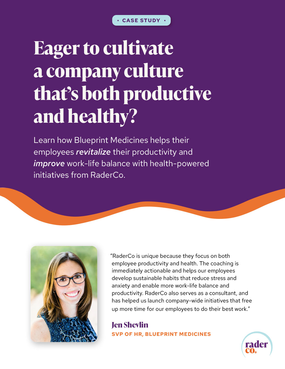
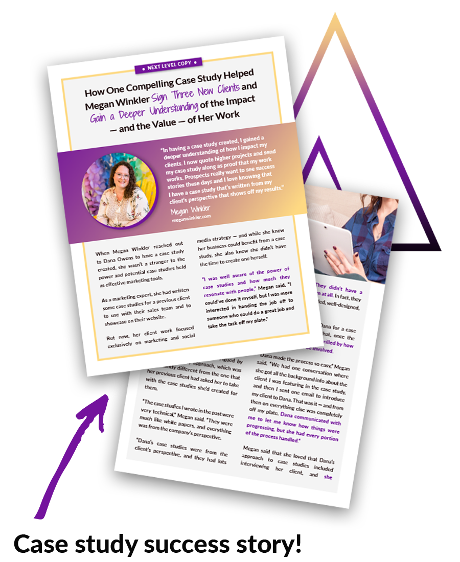
[2020-22] Dana at Next Level Copy reached out to me when she saw the need for a graphic designer who could help with her copywriting business. The case study writing portion of her business was growing and she needed someone who could design interactive PDFs. We’ve created four templates to date for each of her case study offerings, which I customize around the client’s brand guidelines.
Dana and I also collaborate on case study web pages, animated audio graphics, pitch deck designs, maintaining her WordPress website, and creating graphics for her website.


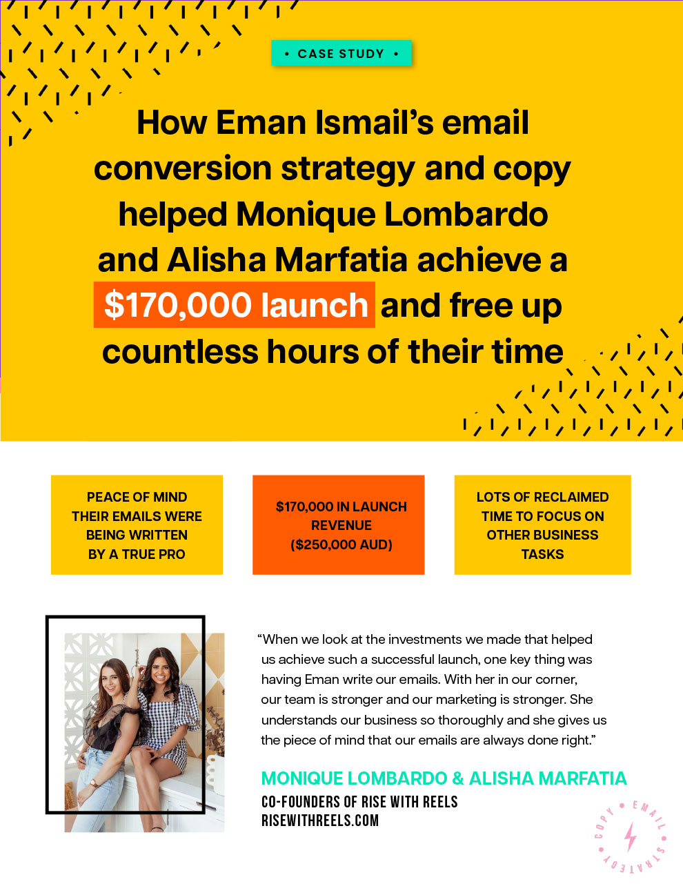


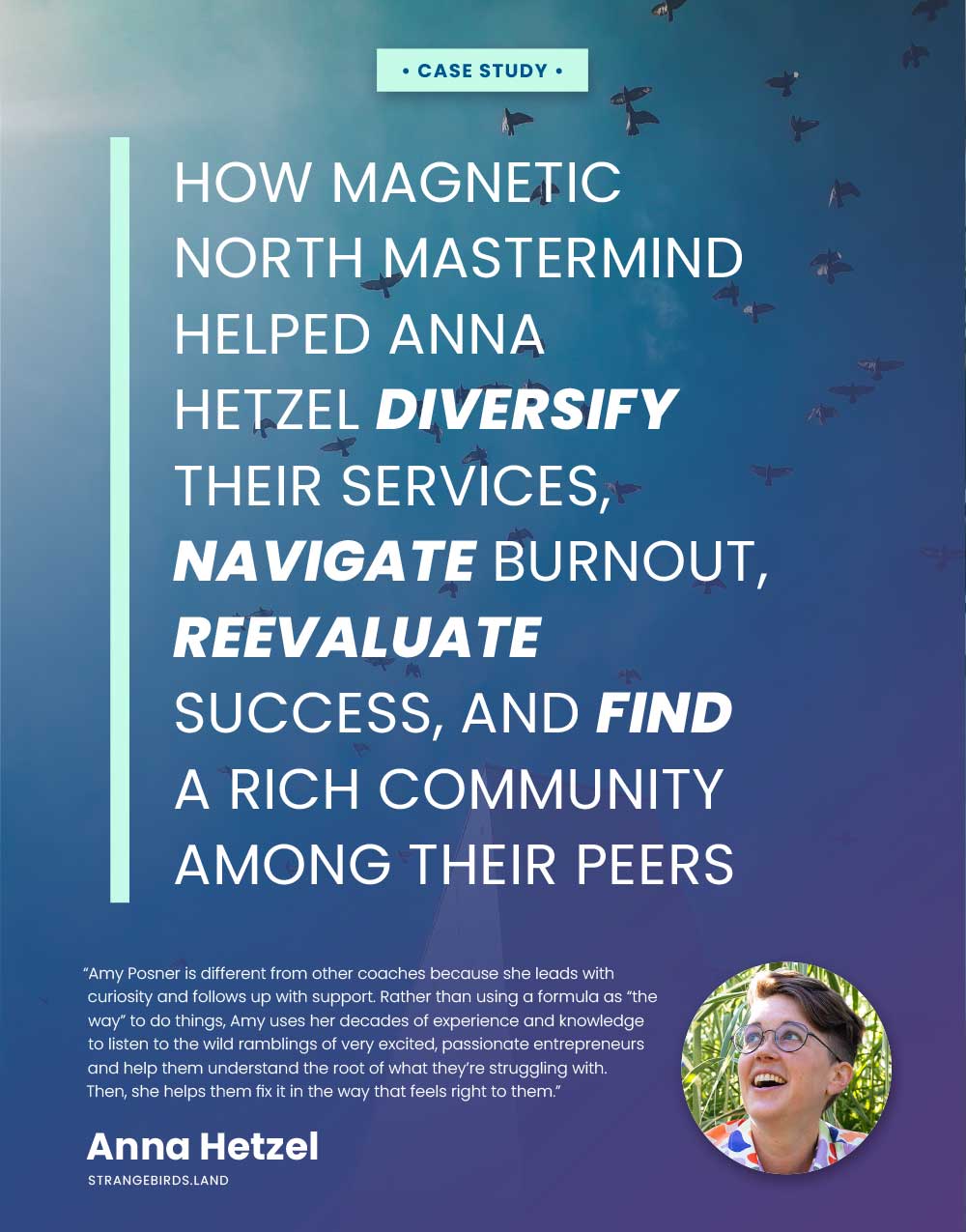

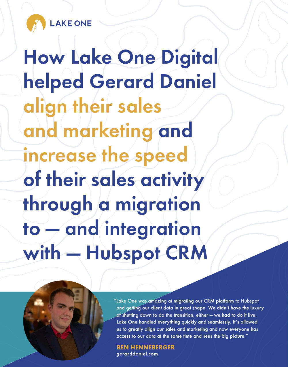


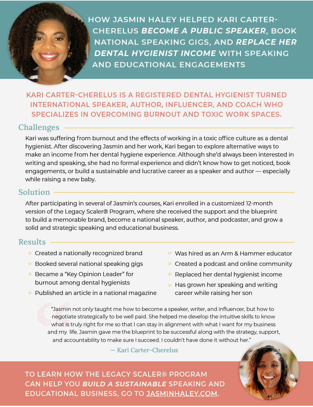

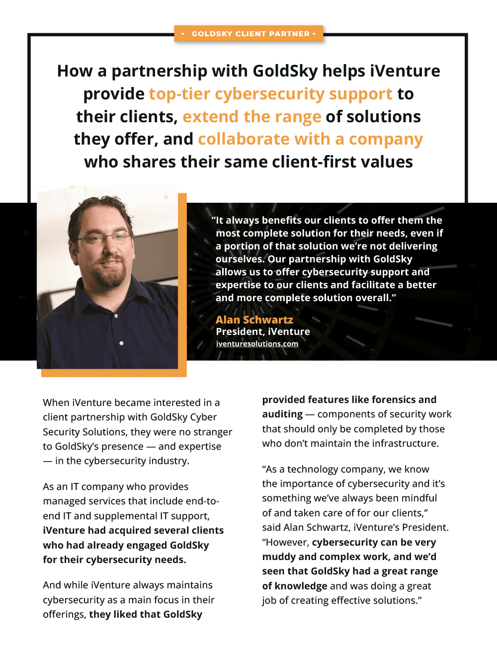

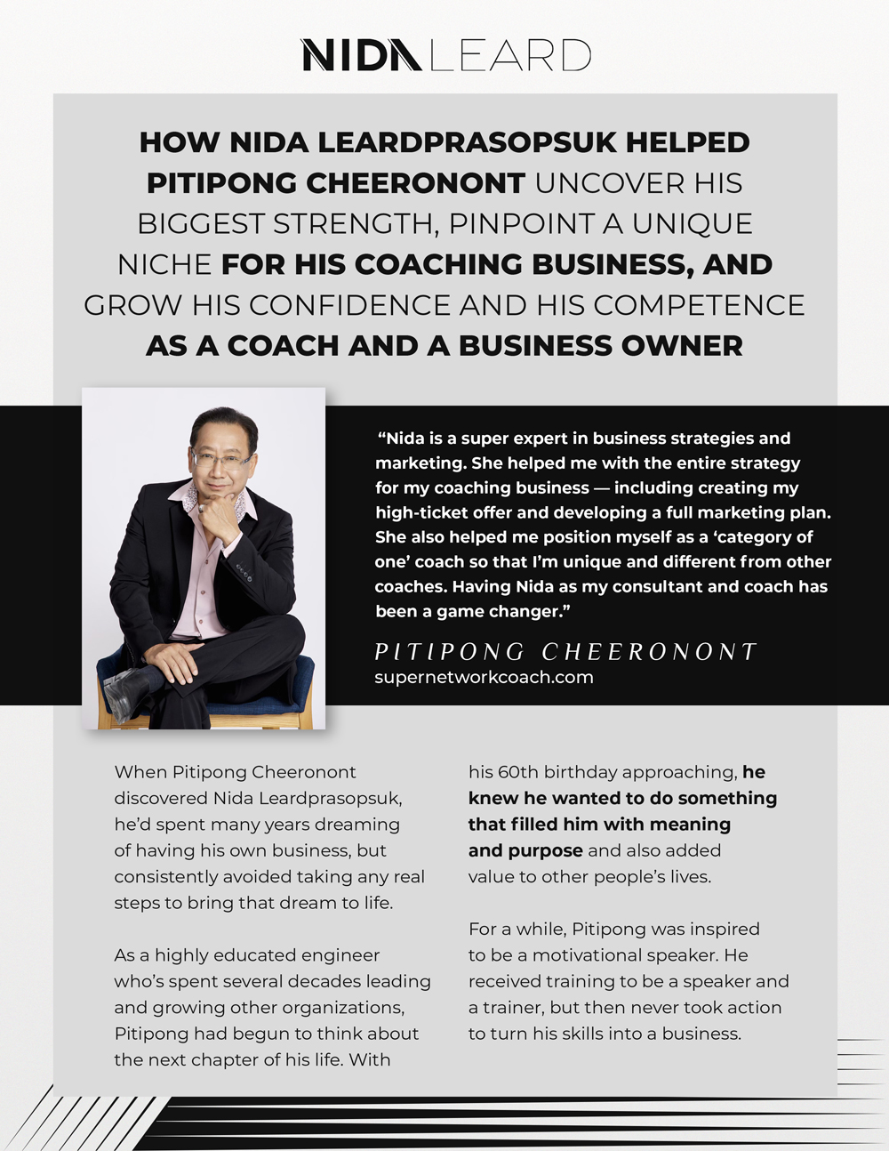
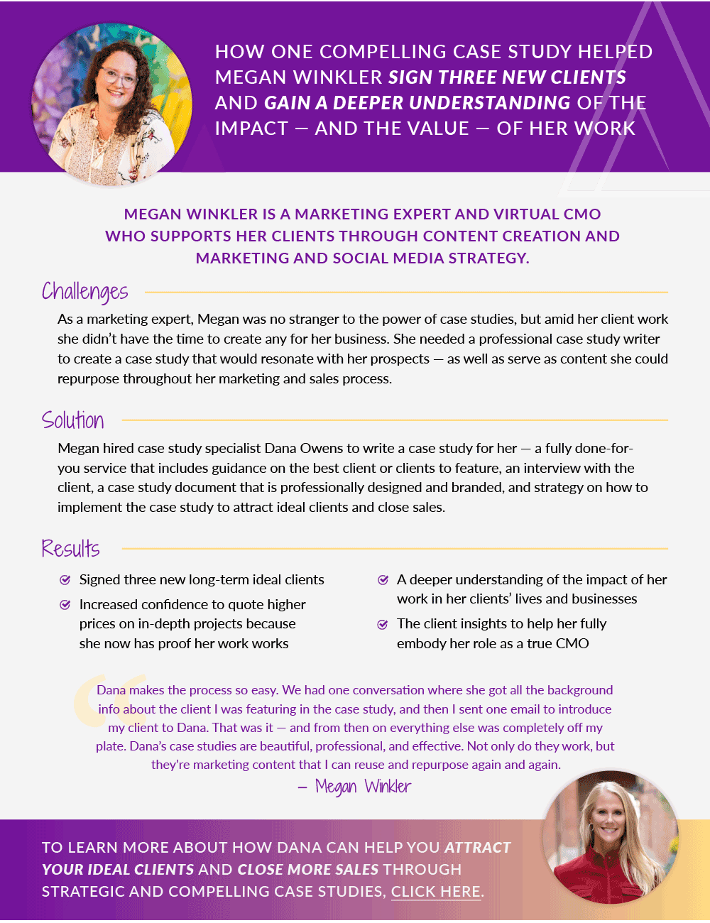
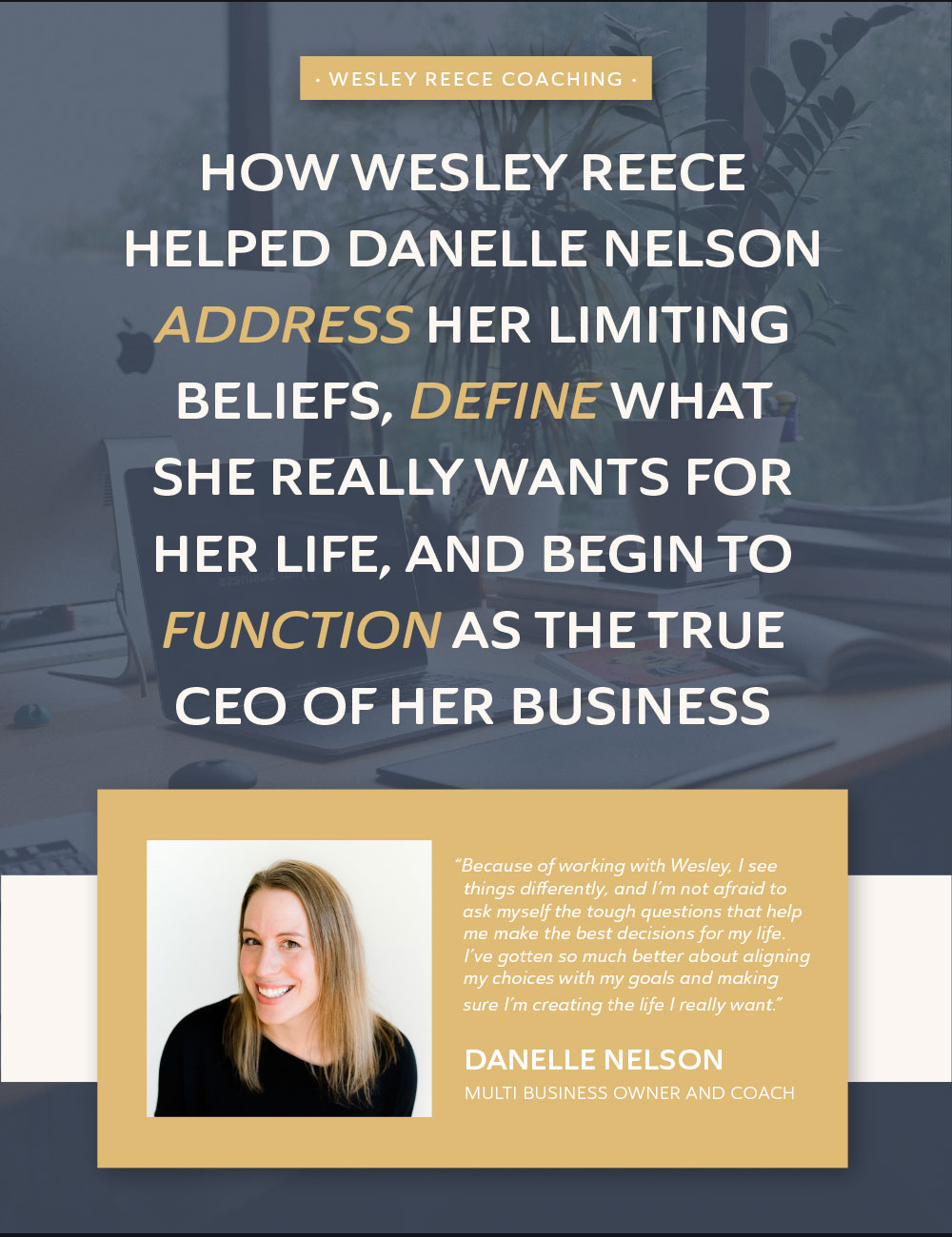
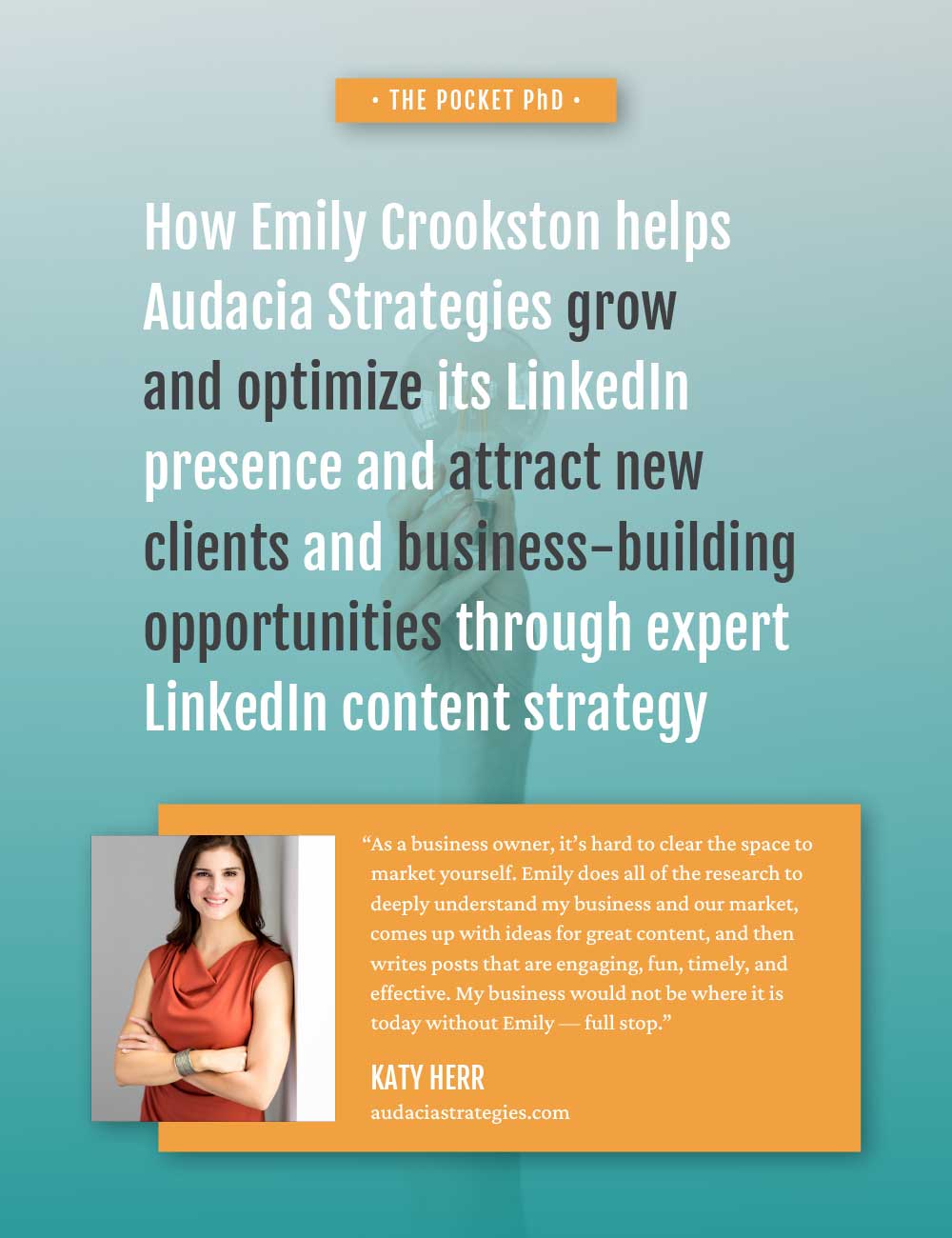


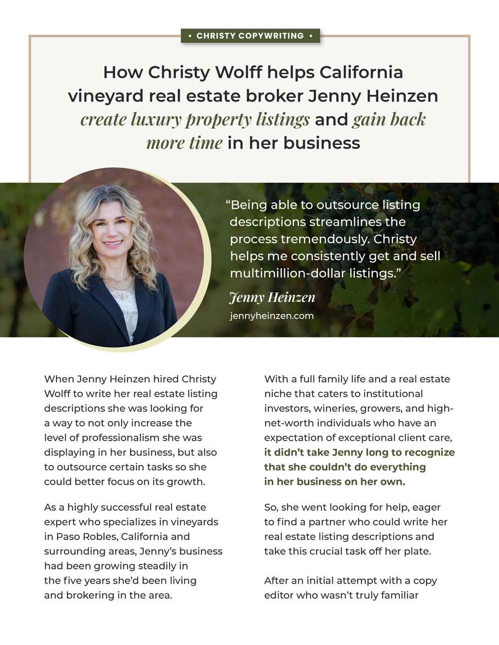
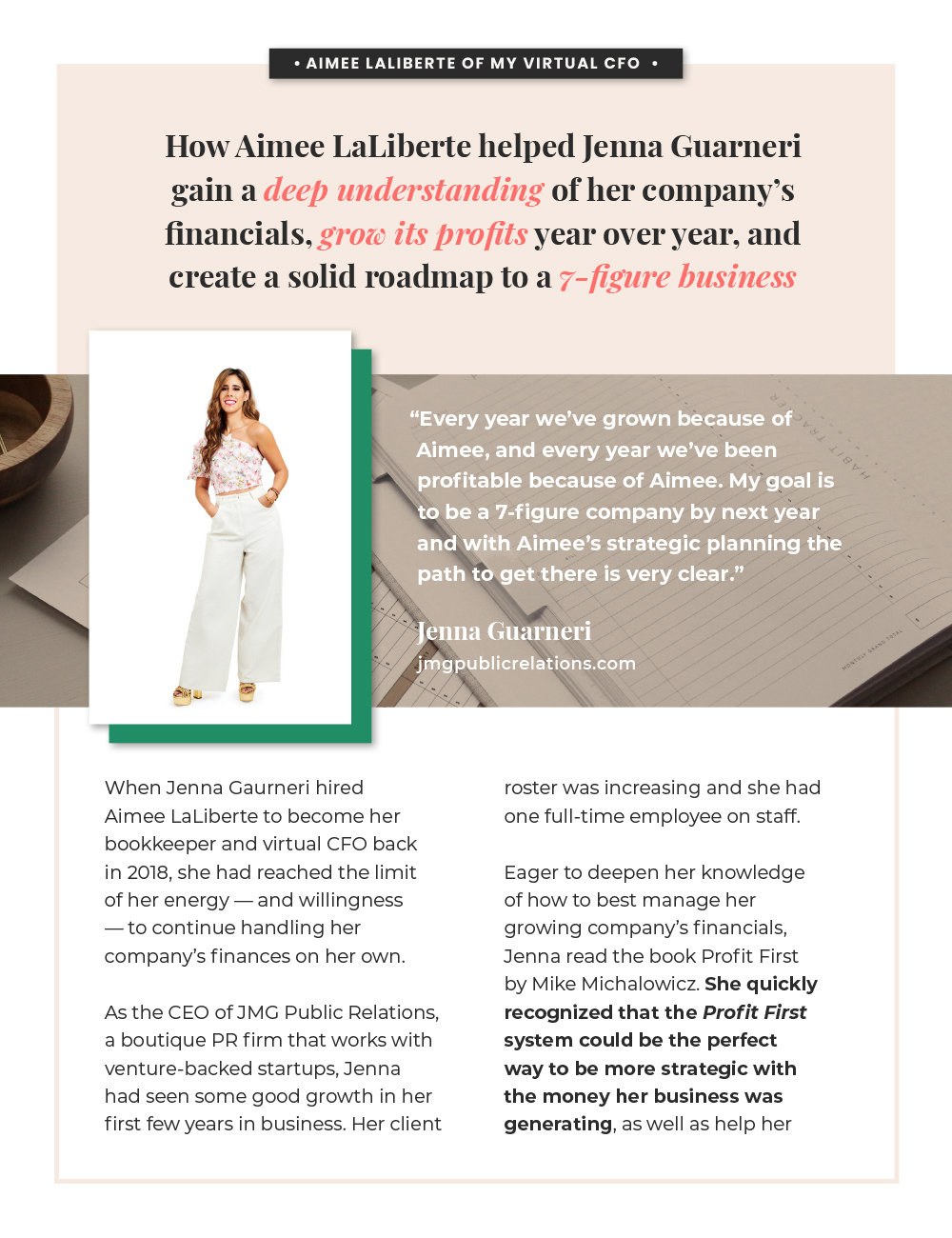

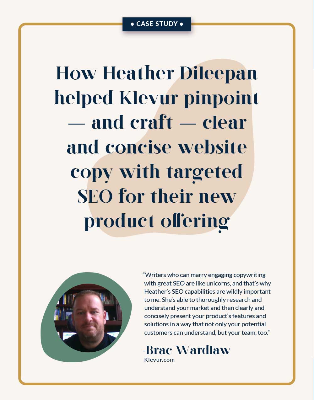
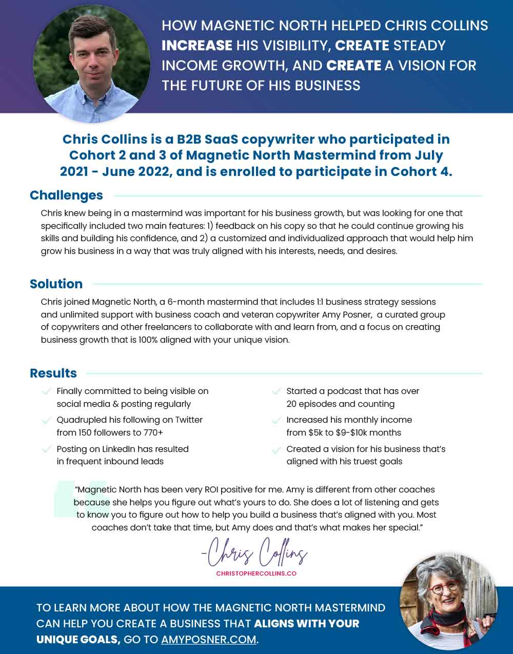
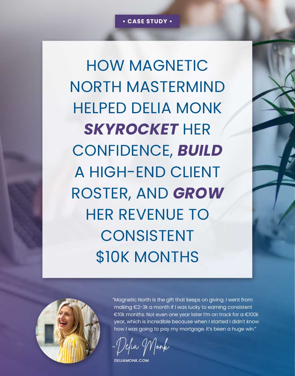
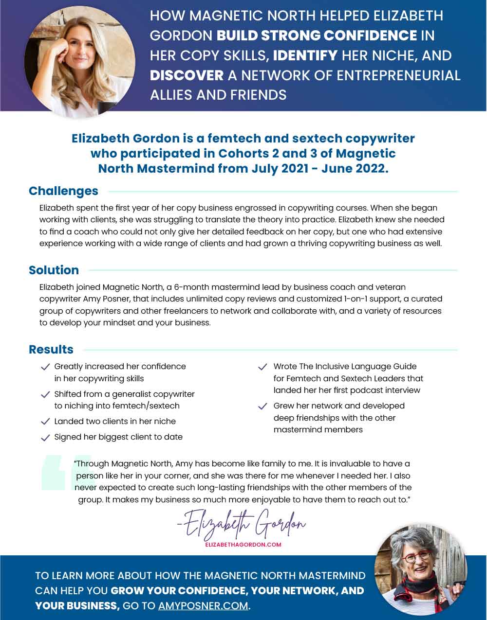
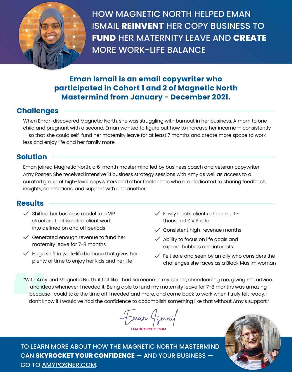

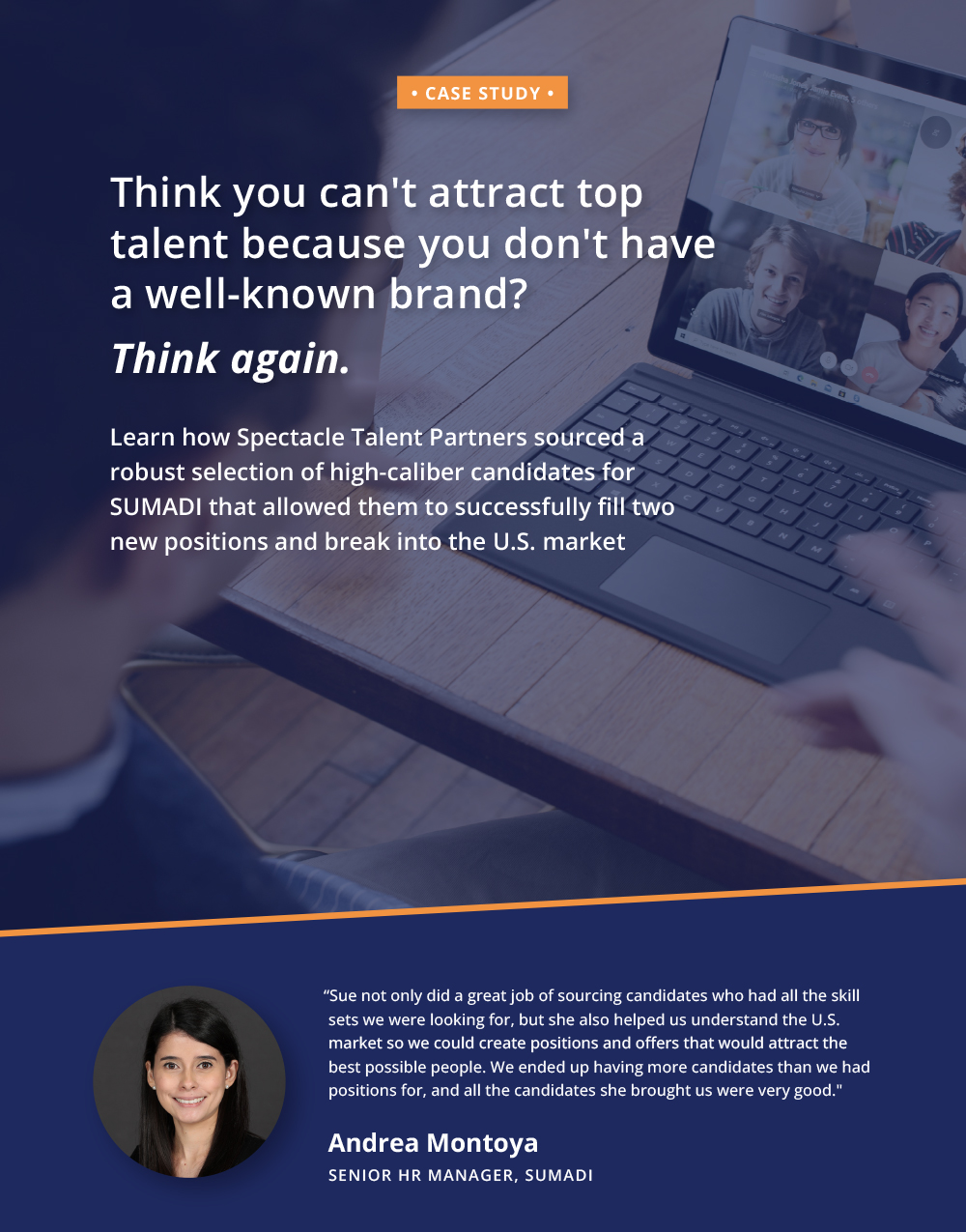


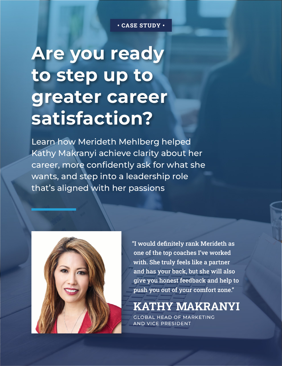
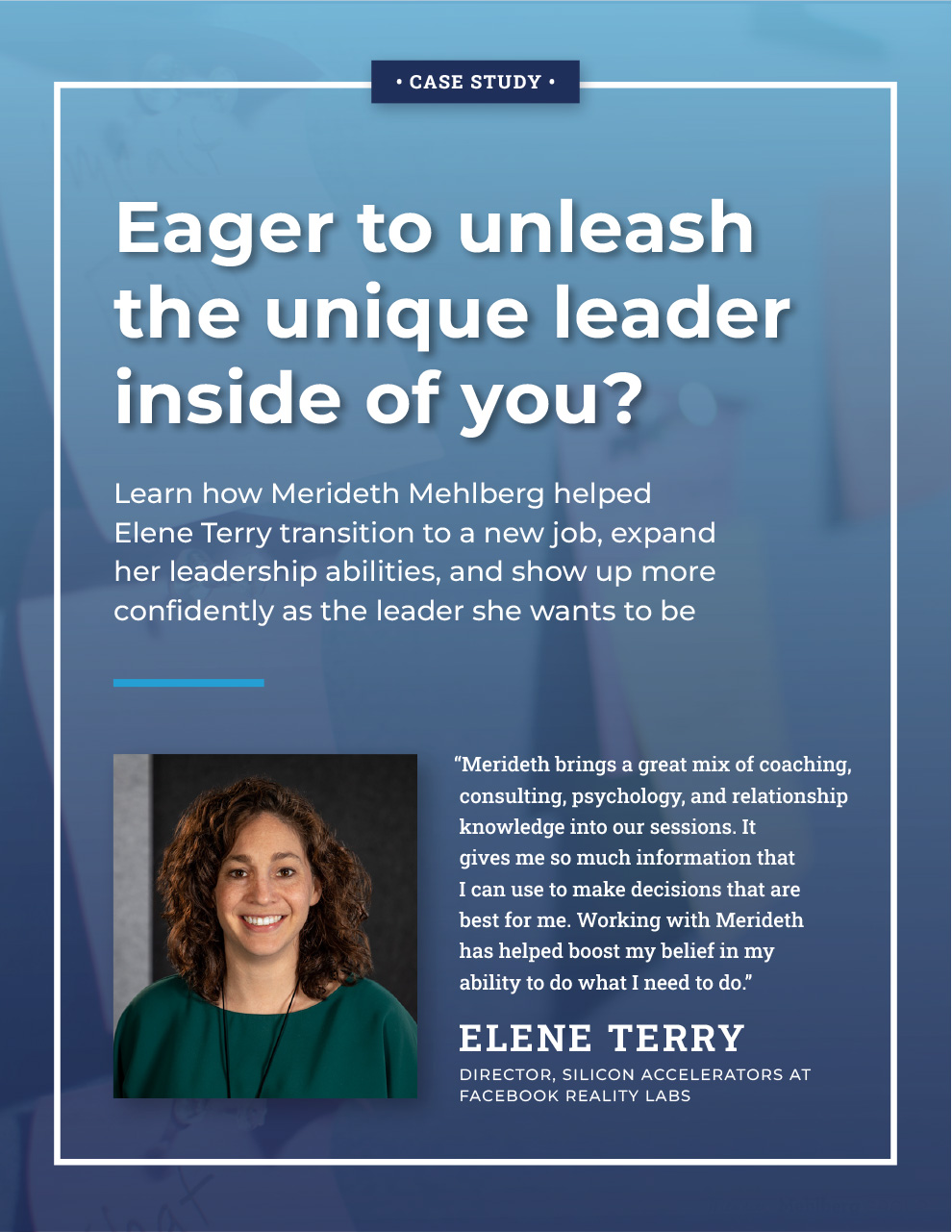
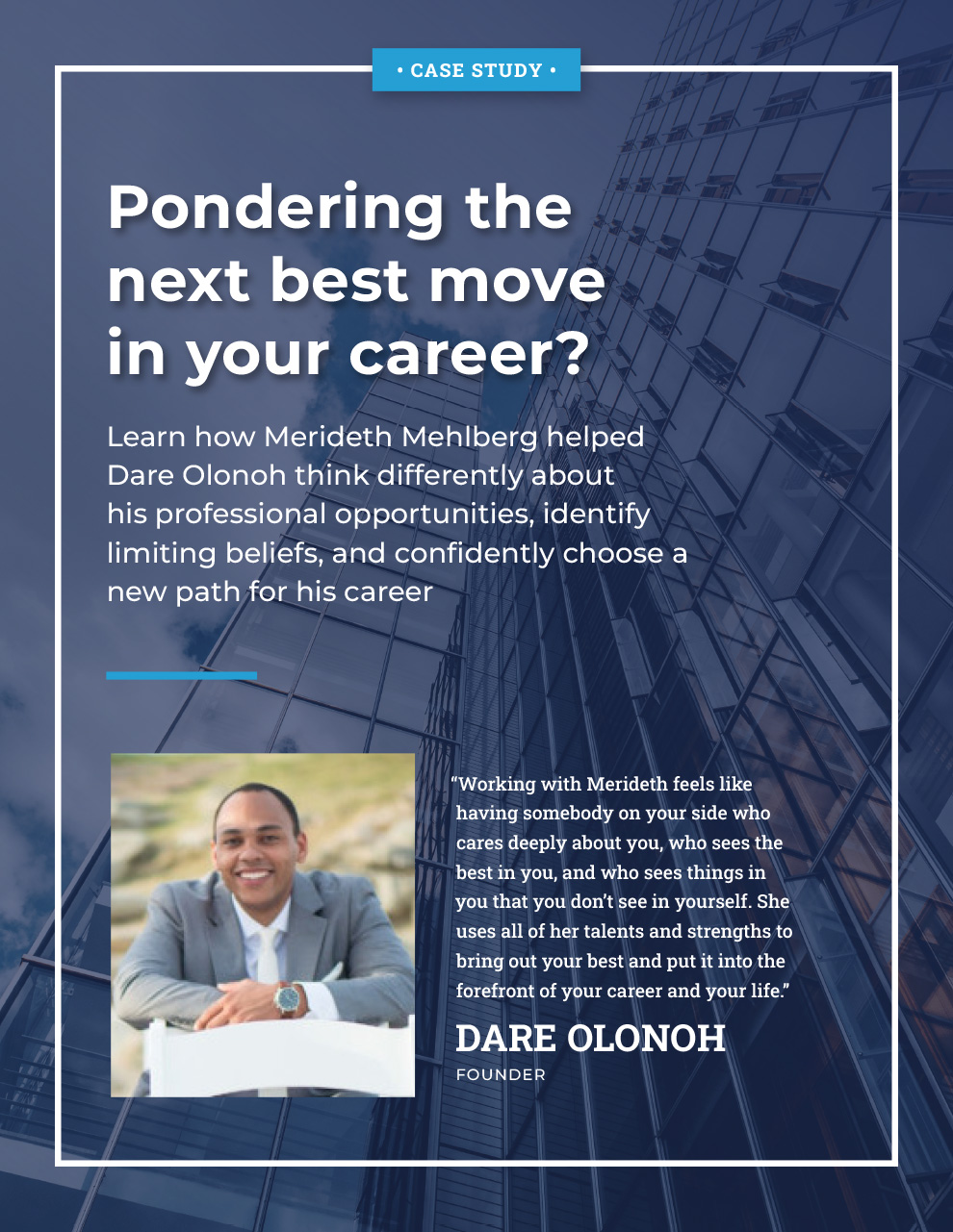


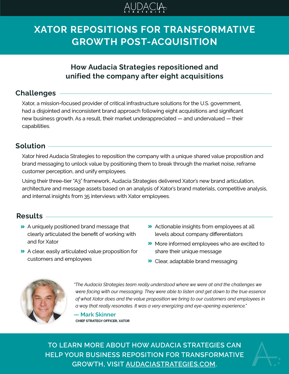


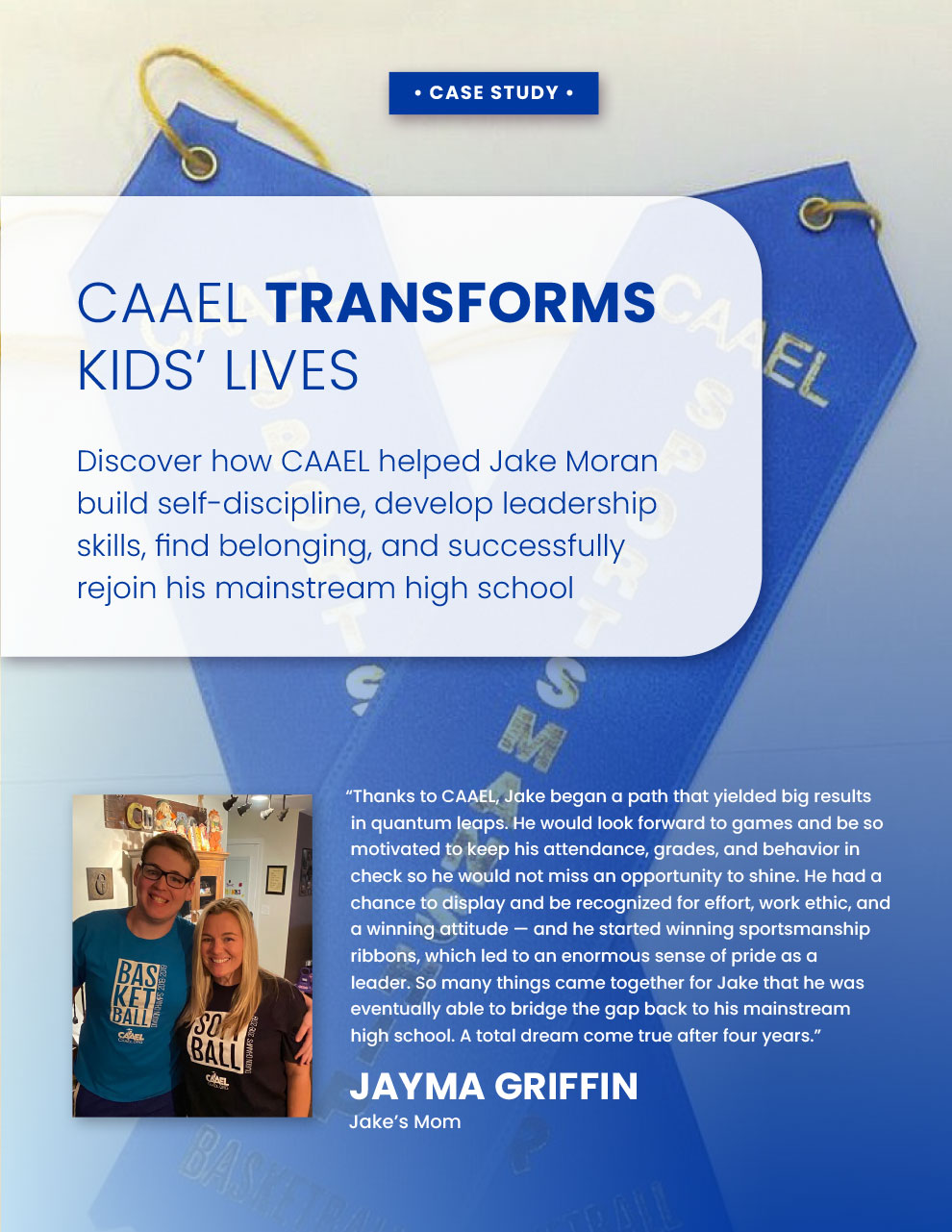

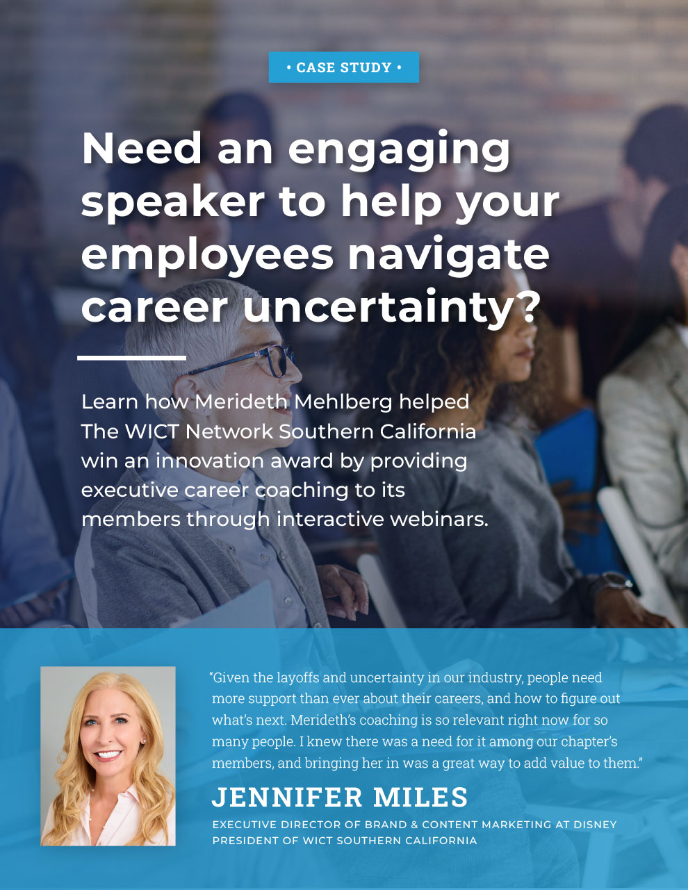


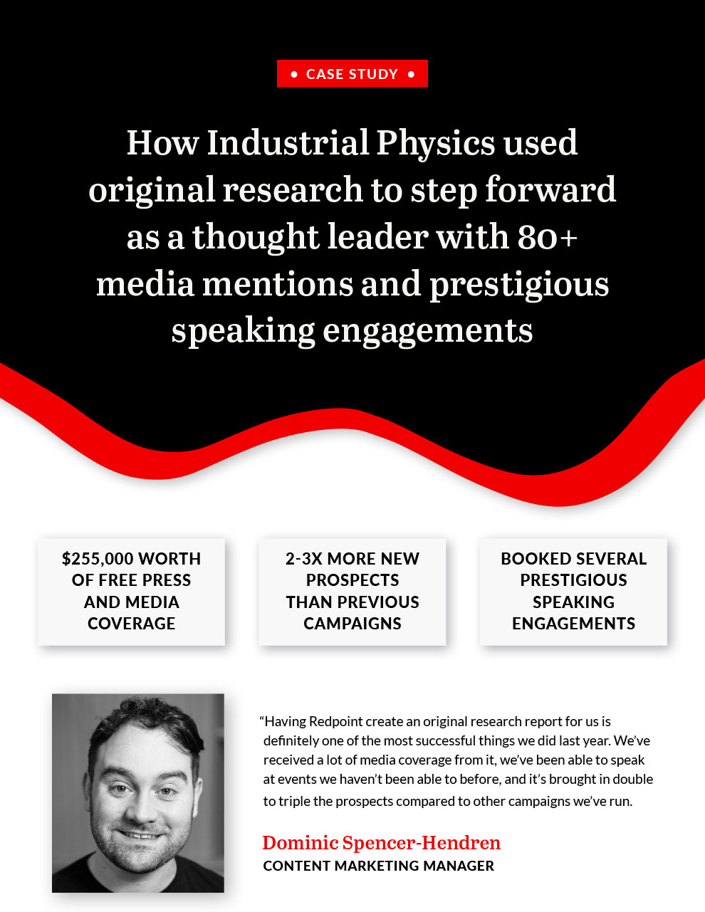
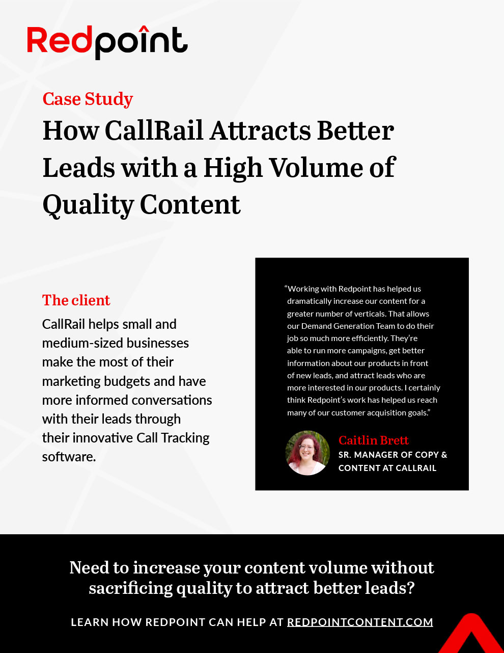
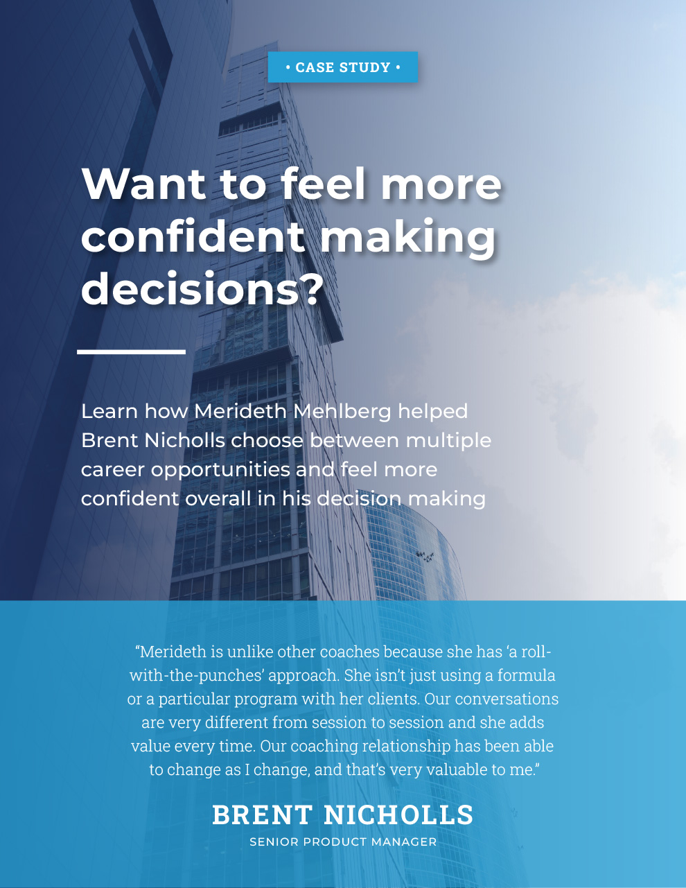
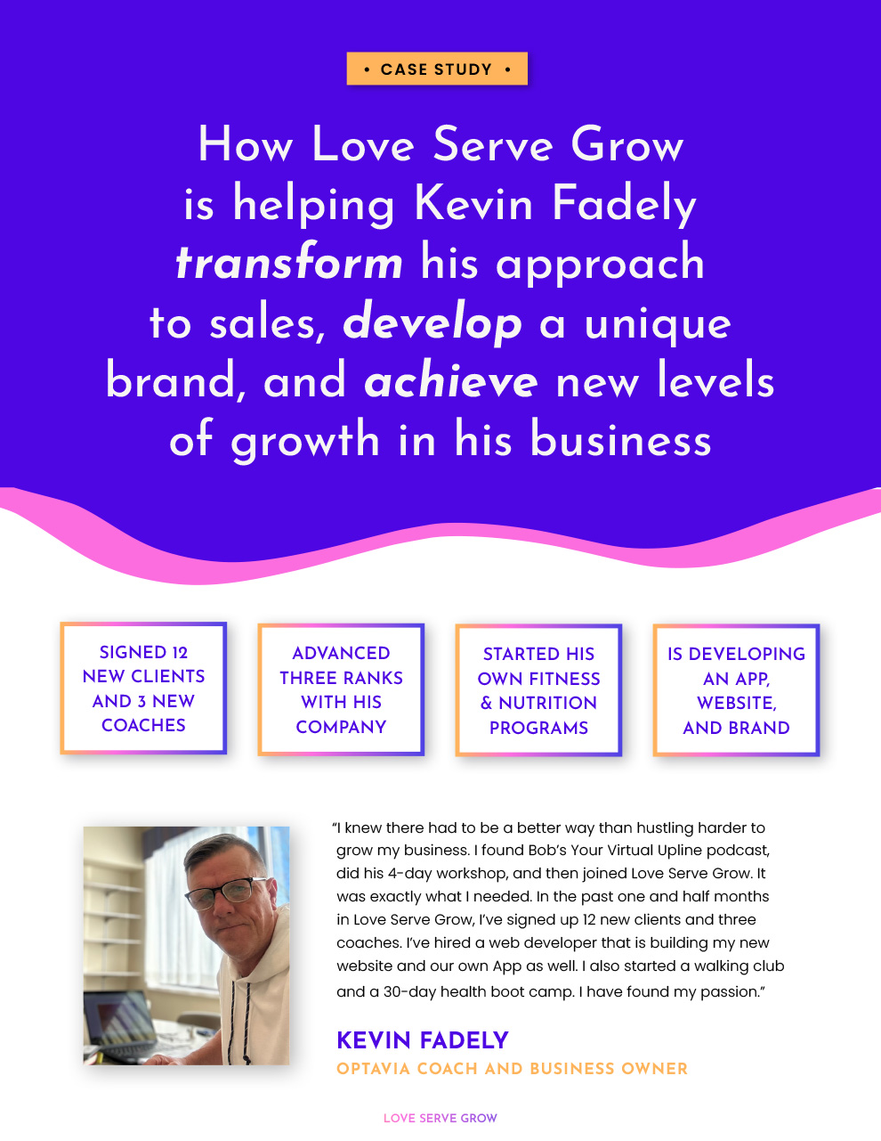
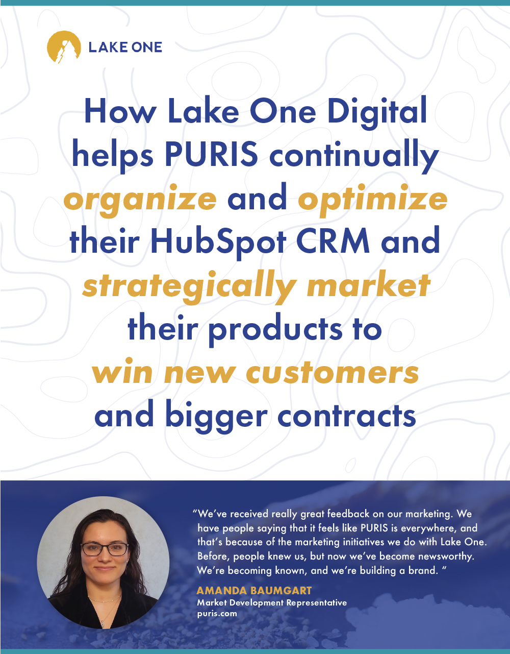
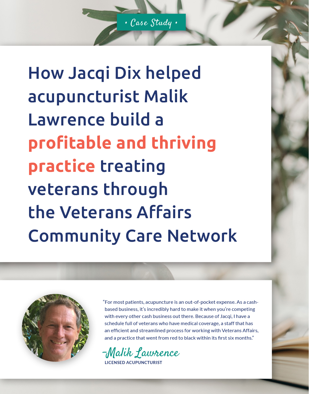

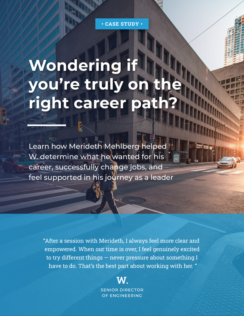
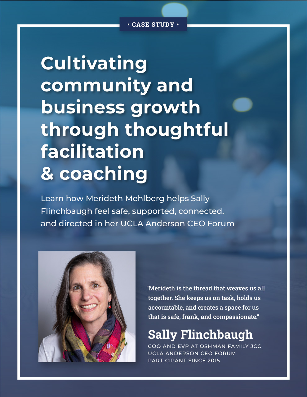


Take a peek at a recent full-story case study
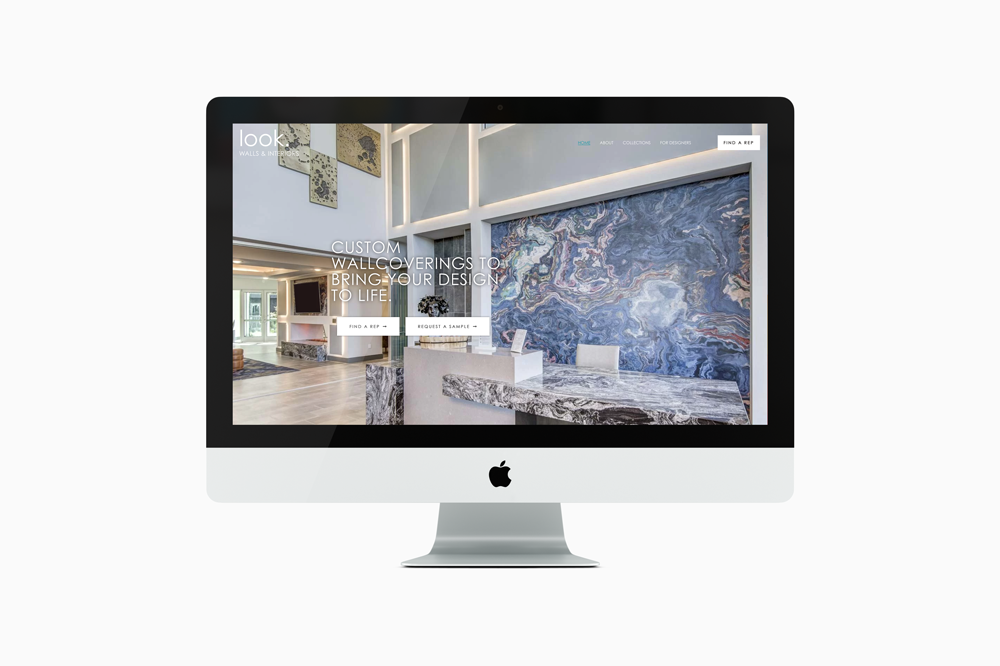
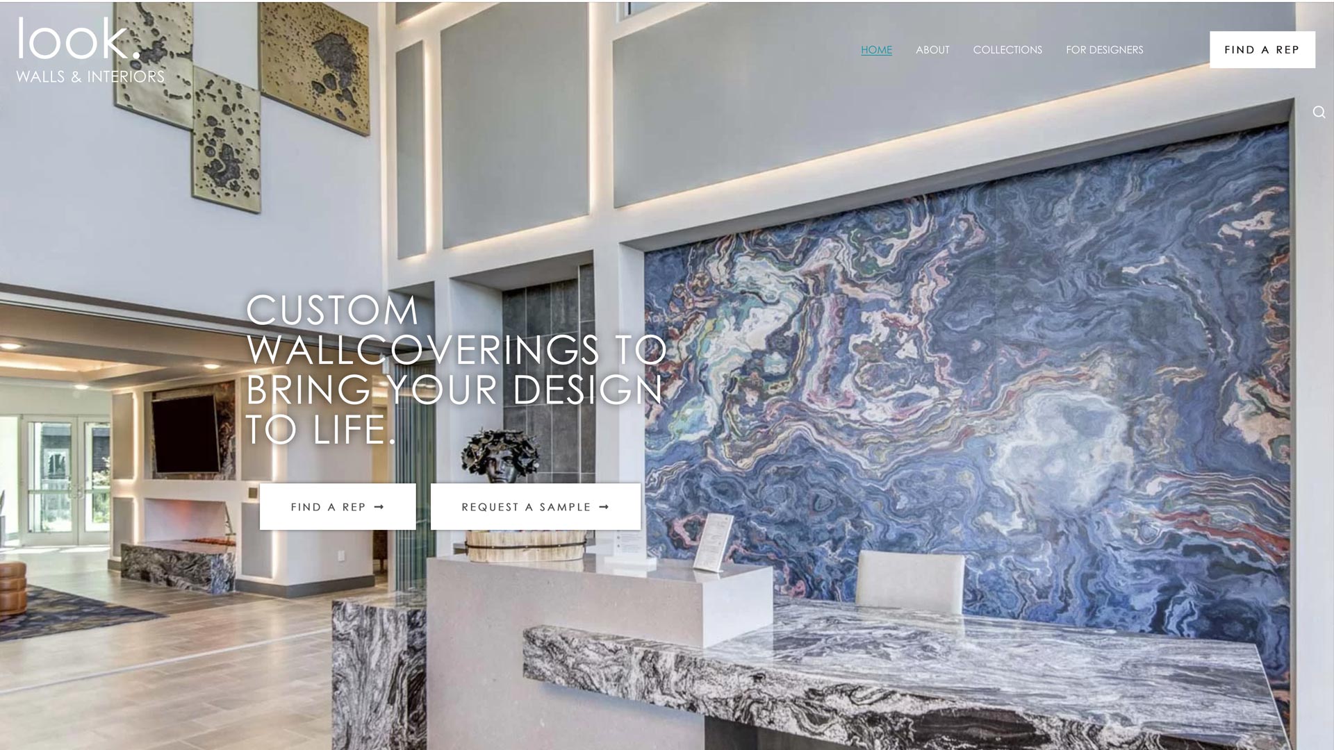
[2021] Brightspot Creative contracted me to redesign and implement a new WordPress website for their client, Look. Walls & Interiors. Their client needed a new website that was elegant and fresh, but more importantly, easier to use for both their reps and other designers. Brightspot handled the brand’s story and messaging. My solution for the website was to utilize their extensive library of full-screen imagery to help showcase their products, implement a FAQ section, create a filtering system for their extensive art database, and use strong CTAs to ensure effective lead generation for their reps. Site built on WordPress.
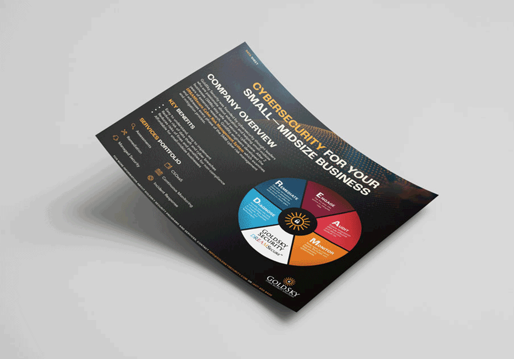
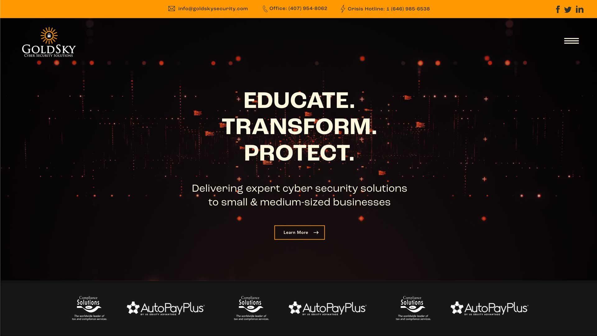
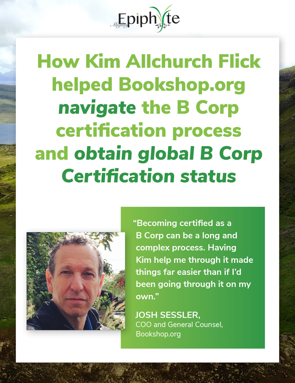
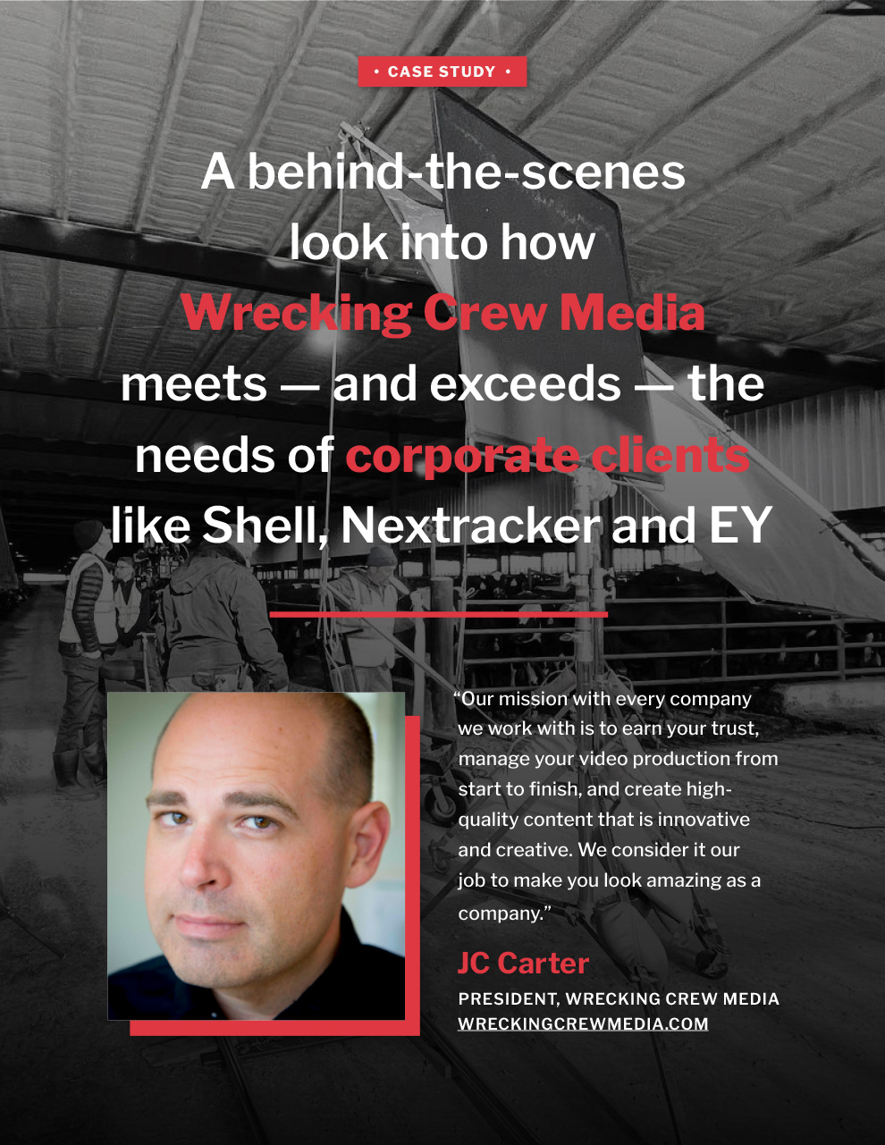
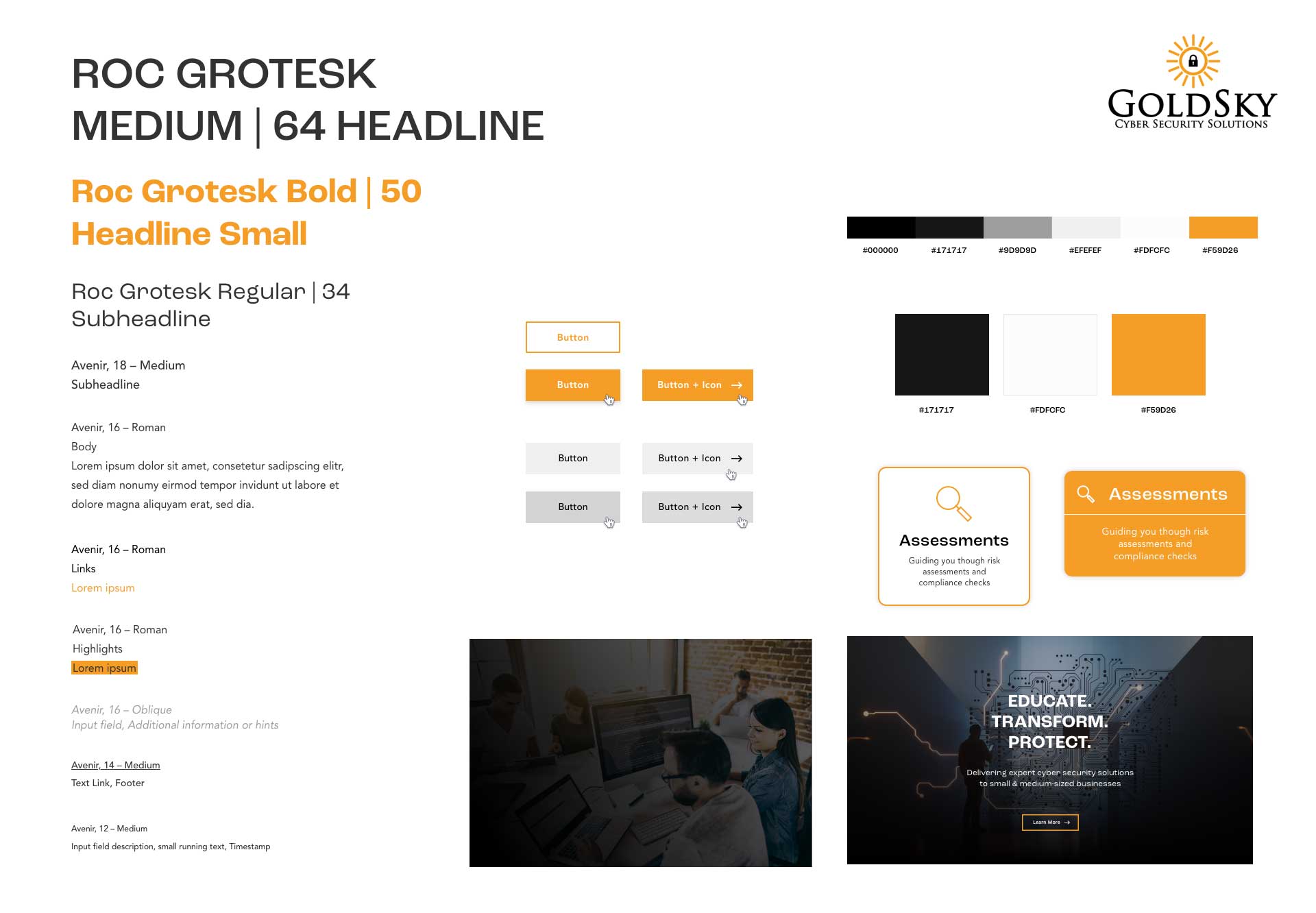
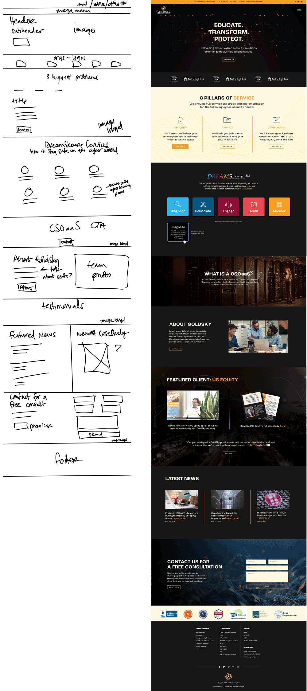
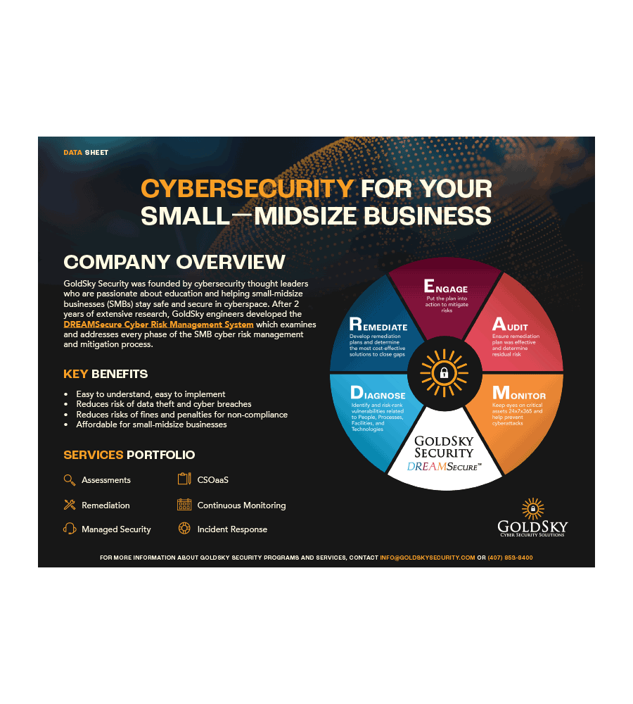
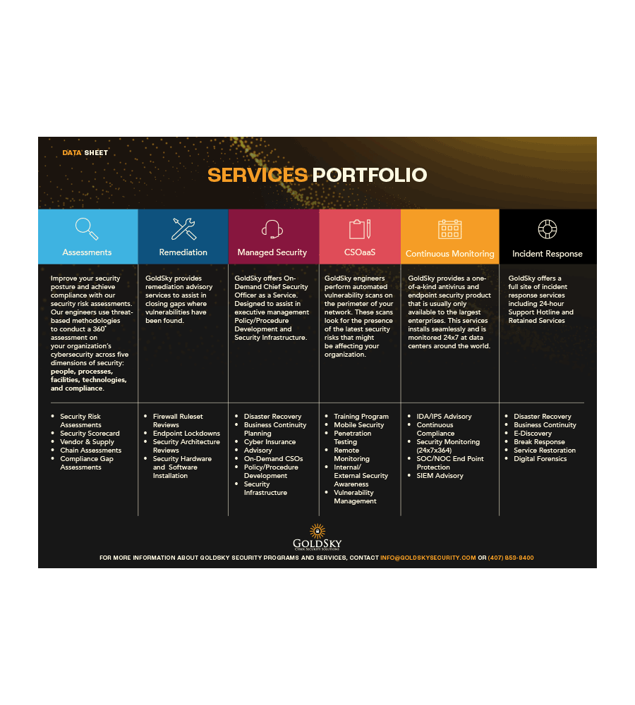
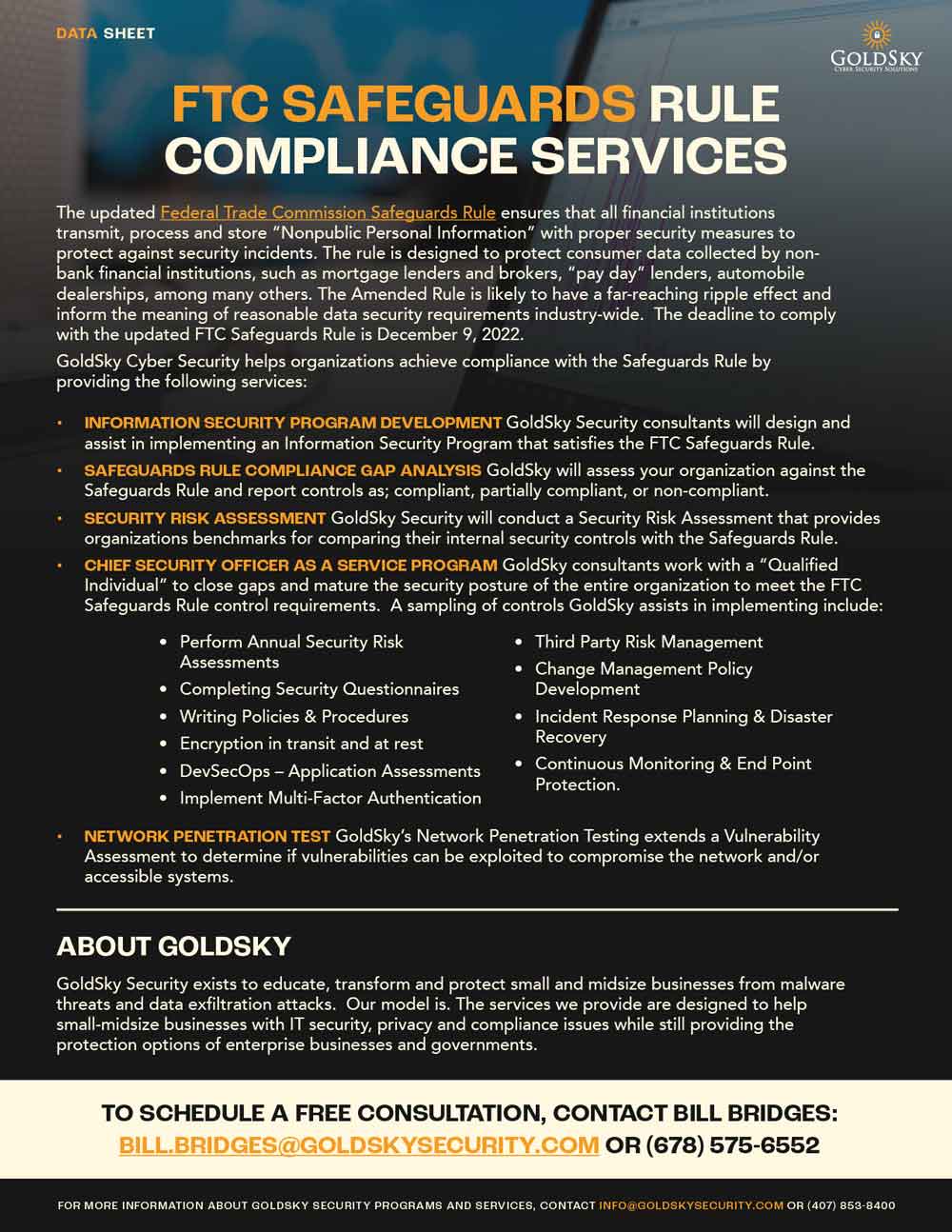
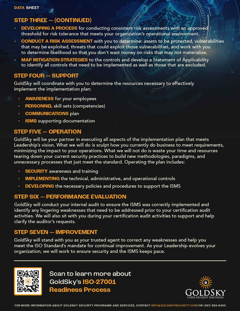
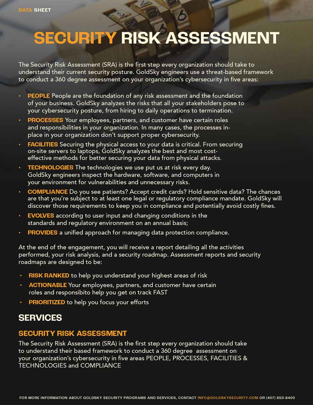
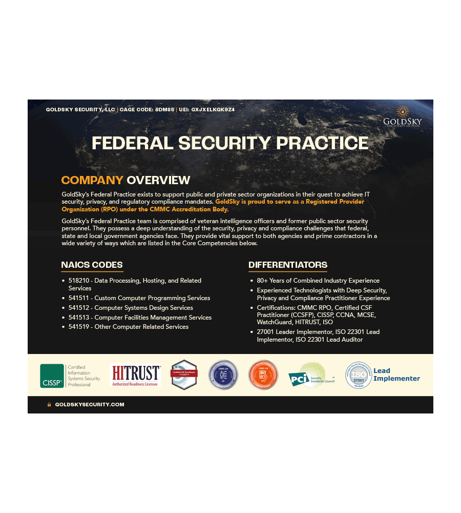
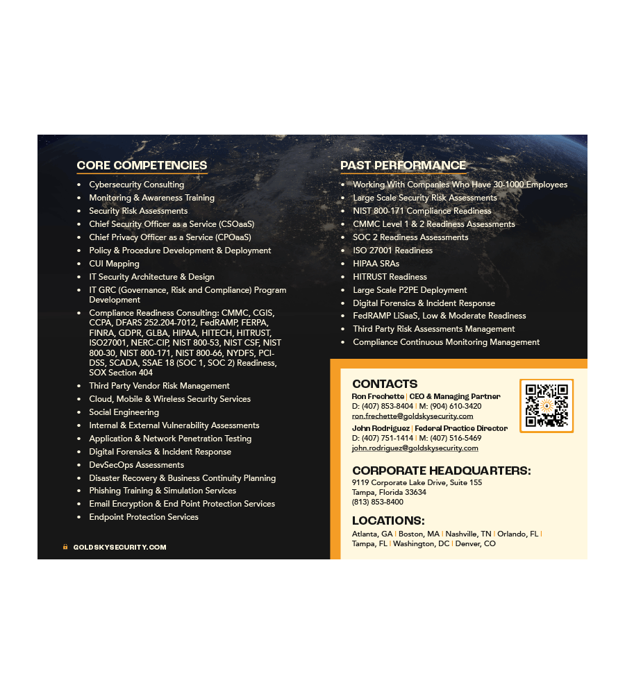
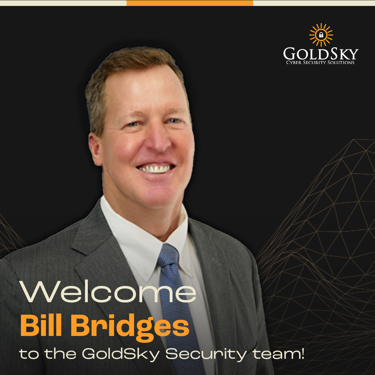
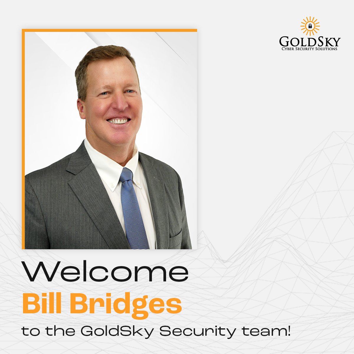
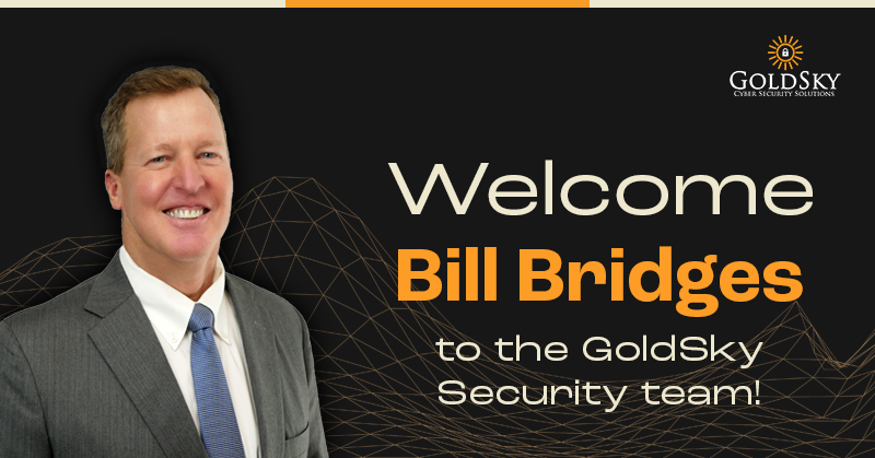
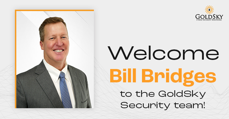
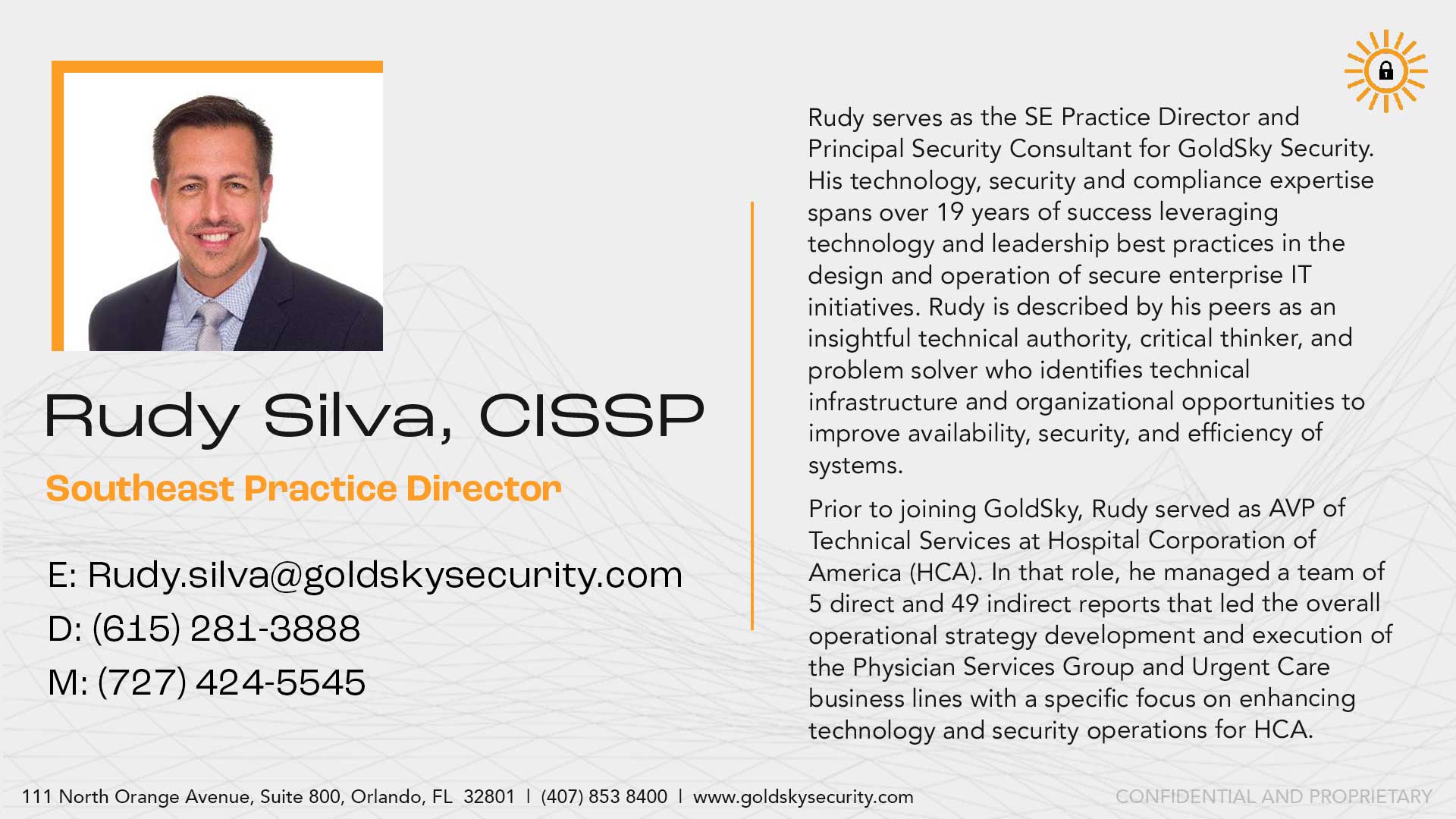
[2022] GoldSky Security was referred to me by another client, Dana from Next Level Copy. Initially, GoldSky needed a new home page designed for their website. My main contact, Keith, gave me carte blanche to completely reimagine their brand (but the logo needed to stay the same). Keeping the idea of trustworthiness at the forefront of my design plans, I began mapping out a mood board that reflected a cyber security brand that was modern and sleek, but still aesthetically approachable and easy to use. After sign-off from the client, I implemented the design elements into a wireframe, then a fully designed mockup for their developer.
After the home page project, GoldSky retained me to complete other web projects, PDF documents, and in-house graphics.


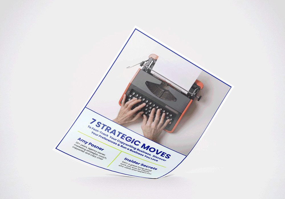
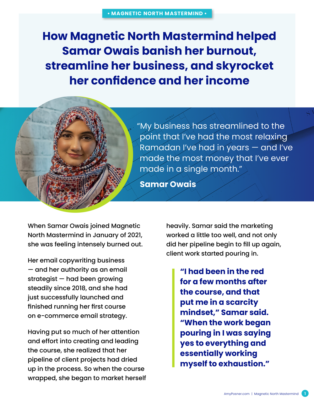
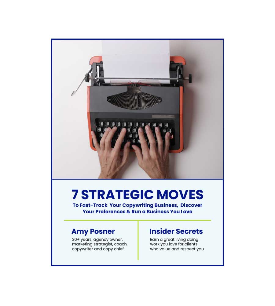
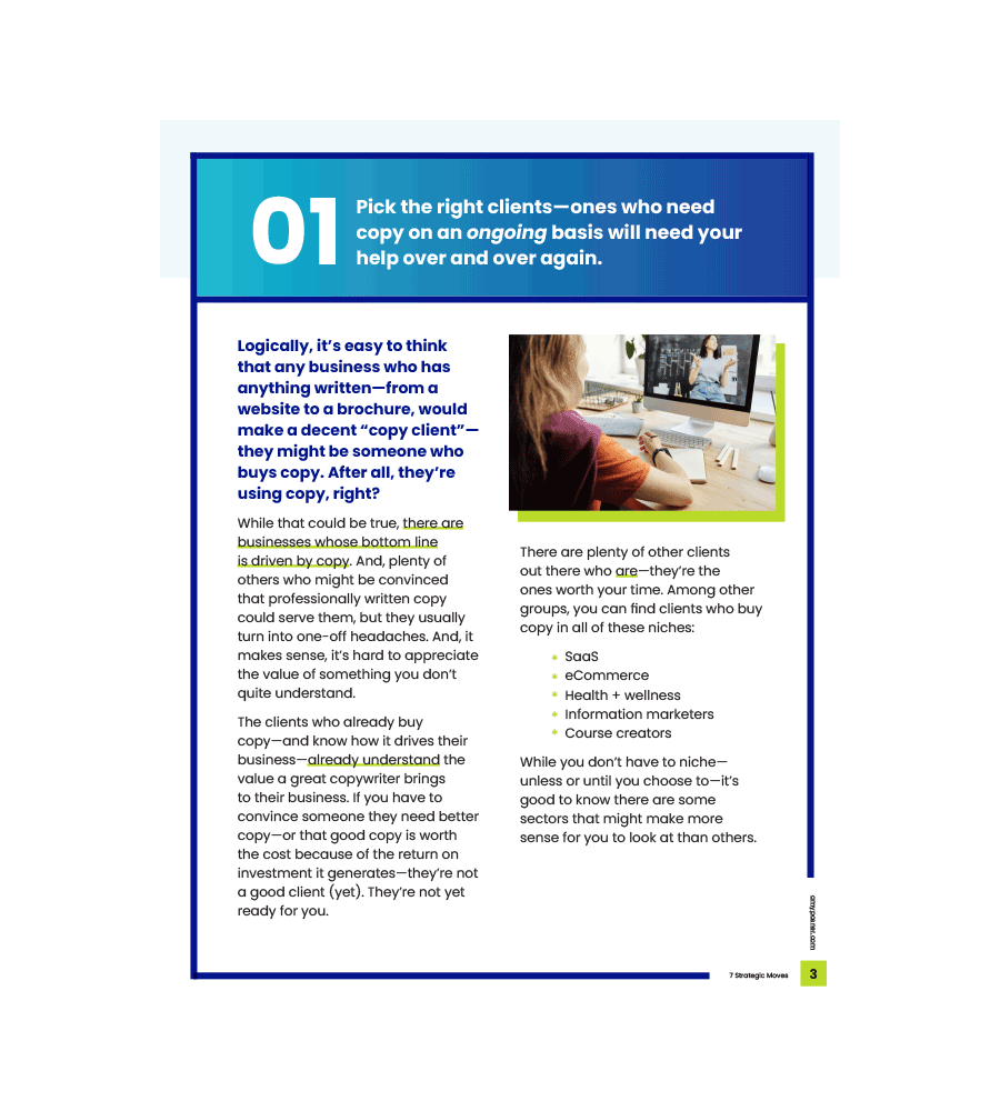
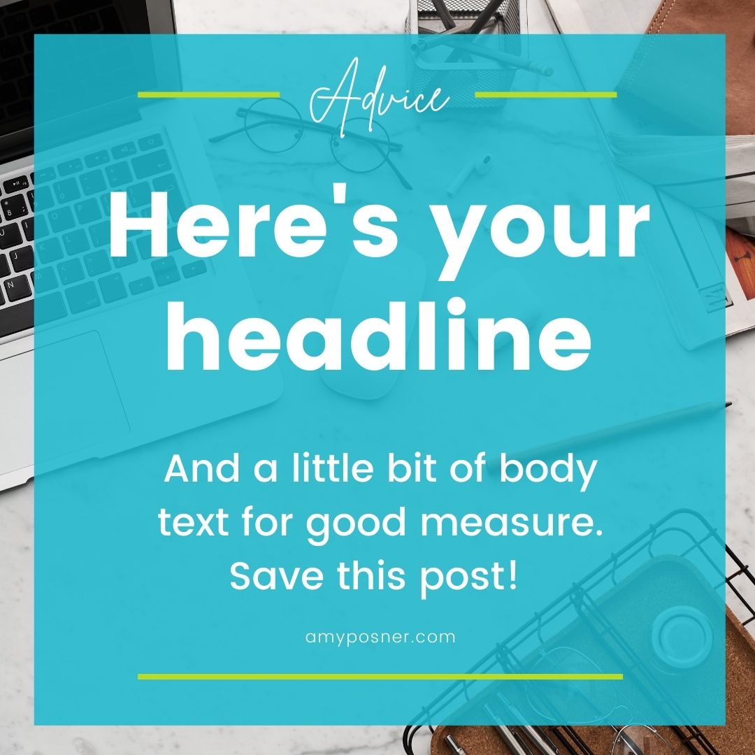
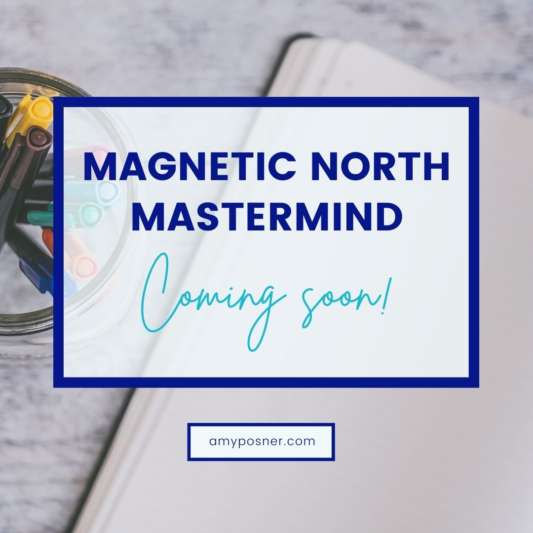
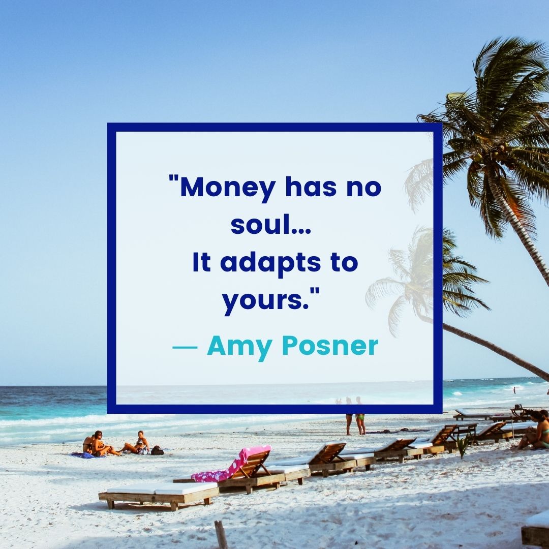
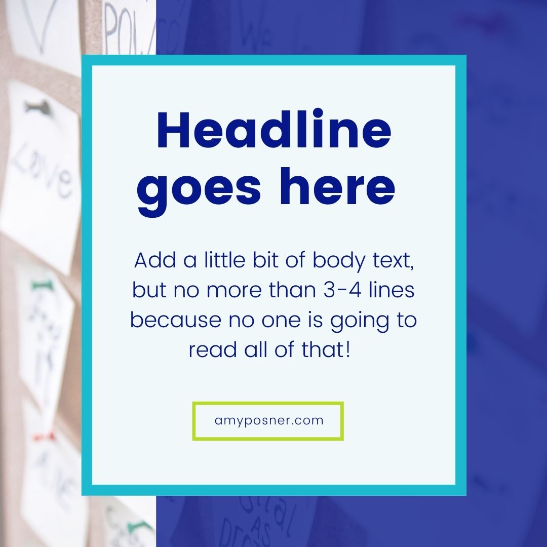
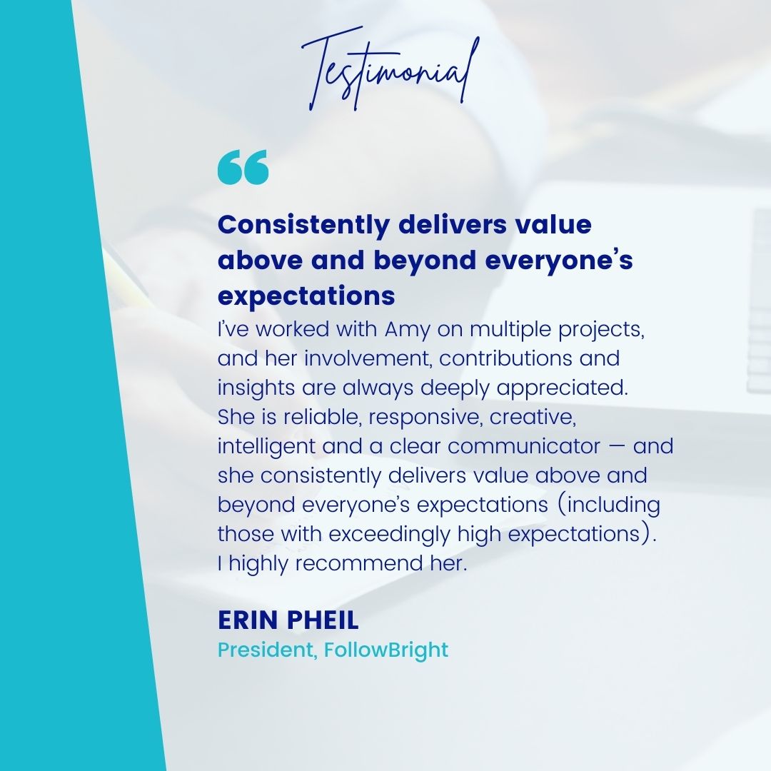
[2021] Amy Posner was referred to me by another client, Dana from Next Level Copy. Amy had a few design needs: a new sales page for her website, social media templates that her team could edit in Canva, and a couple of digital PDFs. After a discovery call, I learned that we would be following her current brand standards–smooth sailing! I worked closely with Amy’s assistant, Anne, hitting project milestones and receiving final approvals from Amy.


